8 Walkthrough 2: Approaching gradebook data from a data science perspective
Abstract
This chapter explores cleaning, tidying, visualizing, and modeling classroom gradebook data. Data scientists in education can work with a variety of data sources, including learning management systems (LMS) or other student platforms. Using gradebook data, this chapter explores how to develop hypotheses about relationships between student work and formative assessments. It walks through how to run correlations and linear regressions in R. The chapter also explains the importance of responsibly reporting analysis results to inform decision making. Data science techniques in this chapter include reading data from Excel, cleaning data, creating new variables, visualizing data, checking model assumptions, and reviewing results.
8.3 Vocabulary
- correlation
- directory
- environment
- factor level
- linear model
- linearity
- missing values/NA
- outliers
- string
8.4 Chapter overview
Whereas Walkthrough 1 in Chapter 7 focused on the education data science pipeline in the context of an online science class, this walkthrough further explores the ubiquitous but not-often-analyzed classroom gradebook dataset. We will use data science tools and techniques, and focus more on analyses, including correlations and linear models.
There are a variety of data sources to explore in the education field. Student assessment scores can be examined for progress towards goals. The text from a teacher’s written classroom observation notes about a particular learner’s in-class behavior or emotional status can be analyzed for trends. We can tap into the exportable data available from common learning software or platforms popular in the K–12 education space.
8.4.1 Background
This walkthrough goes through a series of analyses using the data science framework. The first analysis centers around a common K–12 classroom tool: the gradebook. While gradebook data is common in education, it is sometimes ignored in favor of data collected by evaluators and researchers or data from state-wide tests. Nevertheless, it represents an important untapped data source. A data science approach can reveal the value of analyzing a range of education data sources.
8.4.2 Data sources
We use an Excel gradebook template, Assessment Types Points (https://web.mit.edu/jabbott/www/excelgradetracker.html), coupled with simulated student data. On your first pass through this section, try using our simulated dataset found in this book’s “data” folder.
You can access the “data” folder by navigating to the book’s GitHub repository(https://github.com/data-edu/data-science-in-education) and clicking on the “data” folder.
From inside the “data” folder, click on “gradebooks”.
The file with simulated gradebook data is named ExcelGradeBook.xlsx.
When you click on the file name, you will see two buttons: one that says “Download” and another that says “History”.
Click on the “Download” button to download the ExcelGradeBook.xlsx file to your computer.
8.5 Load packages
As mentioned in the “Foundational Skills” chapter, begin by loading the libraries that will be used. We will load the {tidyverse} package used in Walkthrough 1 in Chapter 7. This chapter has an example of using the {readxl} package to read and import Excel spreadsheets—file types are very common in the education field. We will also use the {janitor} package (Firke, 2023) for the first time. {janitor} provides a number of functions related to cleaning and preparing data.
Make sure you have installed the packages in R on your computer before starting (for an overview and some instructions, see the “Packages” section of the “Foundational Skills” chapter). Load the libraries, as they must be loaded each time we start a new project.
8.6 Import data
In Appendix A, we recommended the use of .csv files, or comma-separated values files, when working with datasets in R. This is because .csv files, with the .csv file extension, are common in the digital world. They are “plain text”—they tend to be faster when imported, do not have formatting, and are generally easier to deal with than Excel files.
However, data won’t always come in your preferred file format. Fortunately, R can import a variety of data file types. This walkthrough imports an Excel file because these file types, with the .xlsx or .xls extensions, are very likely to be encountered in the K–12 education world. We’ll show you two ways to import the gradebook dataset. The first uses a file path, and the second uses the here() function from the {here} package. We recommend using here(), but it’s worthwhile to review both methods.
8.6.1 Import using a file path
First, let’s look at importing the dataset using a file path. This code uses the read_excel() function of the {readxl} package to find and read the data of the desired file. Note the file path that read_excel() takes to find the simulated dataset file named ExcelGradeBook.xlsx, which sits in a folder on your computer if you have downloaded it. The function getwd() will help locate your current working directory. This tells where on the computer R is currently working with files.
For example, an R user on Linux or Mac might see their working directory as: /home/username/Desktop. A Windows user might see their working directory as: C:\Users\Username\Desktop.
From this location, go deeper into files to find the desired file. For example, if you downloaded the book repository (https://github.com/data-edu/data-science-in-education) from Github to your Desktop, the path to the Excel file might look like one of these below:
/home/username/Desktop/data-science-in-education/data/gradebooks/ExcelGradeBook.xlsx(on Linux & Mac)C:\Users\Username\Desktop\data-science-in-education\data\gradebooks\ExcelGradeBook.xlsx(on Windows)
After locating the sample Excel file, use the code below to run the function read_excel(), which reads and saves the data from ExcelGradeBook.xlsx to an object also called ExcelGradeBook. Note the two arguments specified in this code: sheet = 1 and skip = 10. This Excel file is similar to one you might encounter in real life with superfluous features that we are not interested in. This file has three different sheets, and the first ten rows contain things we won’t need. Thus, sheet = 1 tells read_excel() to just read the first sheet in the file and disregard the rest. Then, skip = 10 tells read_excel() to skip reading the first 10 rows of the sheet and start reading from row 11, which is where the column headers and data actually start inside the Excel file. Remember to replace path/to/file.xlsx with your own path to the file you want to import.
8.6.2 Import using here()
Whenever possible, we prefer to use here() from the {here} package because it conveniently guesses the correct file path based on the working directory. In your working directory, place the ExcelGradeBook.xlsx file in a folder called “gradebooks”. Then place the “gradebooks” folder in a folder called “data”. The last step is to make sure your new “data” folder and all its contents are in your working directory. Following those steps, use this code to read the data in:
# Use readxl package to read and import file and assign it a name
ExcelGradeBook <-
  read_excel(
    here("data", "gradebooks", "ExcelGradeBook.xlsx"),
    sheet = 1,
    skip = 10
  )
The ExcelGradeBook file has been imported into RStudio. Next, assign the data frame to a new name using the code below. Renaming cumbersome filenames can improve the readability of the code and make it easier for the user to call on the dataset later on in the code.
Your environment will now have two versions of the dataset. There is ExcelGradeBook, which is the original dataset we’ve imported. There is also gradebook, which is a copy of ExcelGradeBook. As you progress through this section, we will work primarily with the gradebook version. While working through this walkthrough, if you make a mistake and mess up the gradebook data frame and are not able to fix it, you can reset the data frame to return to the same state as the original ExcelGradeBook data frame by running gradebook <- ExcelGradeBook again. This will overwrite any errors in the gradebook data frame with the originally imported ExcelGradeBook data frame.
8.7 Process data
8.7.1 Tidy data
This walkthrough uses an Excel data file because it is one that we are likely to encounter. Moreover, the messy state of this file mirrors what might be encountered in real life. The Excel file contains more than one sheet, has rows we don’t need, and uses column names that have spaces between words. The data is not tidy. All these things make the data tough to work with. We can begin to overcome these challenges before importing the file into RStudio by deleting the unnecessary parts of the Excel file then saving it as a .csv file. However, if you clean the file outside of R, this means if you ever have to clean it up again (say, if the dataset is accidentally deleted and you need to re-download it from the original source), you would have to do everything from the beginning and may not recall exactly what you did in Excel prior to importing the data to R. We recommend cleaning the original data in R so that you can recreate all the steps necessary for your analysis. Also, the untidy Excel file provides realistic practice for tidying up the data programmatically (using a computer program) with R itself, instead of doing these steps manually.
First, we want to modify the column names of the gradebook data frame to remove any spaces and replace them with an underscore. Using spaces in column names in R can present difficulties later on when working with the data.
Second, we want the column names of our data to be easy to use and understand. The original dataset has column names with uppercase letters and spaces. We can use the {janitor} package to quickly change them to a more usable format.
8.7.2 About {janitor}
The {janitor} package is a great resource for anybody who works with data, and particularly fantastic for data scientists in education. Created by Sam Firke, the Analytics Director of The New Teacher Project, it is a package created by a practitioner in education with education data in mind.
{janitor} has many handy functions to clean and tabulate data. Some examples include:
clean_names(), which takes messy column names that have periods, capitalized letters, spaces, etc., and changes the column names into an R-friendly formatget_dupes(), which identifies and examines duplicate recordstabyl(), which tabulates data in adata.frameformat, and can be “adorned” with theadorn_functions to add total rows, percentages, and other dressings
Let’s use {janitor} with this data!
First, let’s have a look at the original column names. The output will be long, so let’s just look at the first ten by using head().
## [1] "Class"           "Name"            "Race"            "Gender"
## [5] "Age"             "Repeated Grades"
You can look at the full output by removing the call to head().
Now let’s look at the cleaned names:
## [1] "class"           "name"            "race"            "gender"
## [5] "age"             "repeated_grades"
Review what the gradebook data frame looks like now. It shows 25 students and their individual values in various columns like projects or formative_assessments.
The data frame looks cleaner but there still are some things we can remove. For example, there are rows without any names in them. Also, there are entire columns that are unused and contain no data (such as gender). These are called missing values and are denoted by NA. Since our simulated classroom only has 25 learners and doesn’t use all the columns for demographic information, we can safely remove these to tidy up our dataset even more.
We can remove the extra columns rows that have no data using the {janitor} package. The handy remove_empty() removes columns, rows, or both that have no information in them.
# Removing rows with nothing but missing data
gradebook <-
  gradebook %>%
  remove_empty(c("rows", "cols"))
Now that the empty rows and columns have been removed, notice that there are two columns, absent and late, where it seems someone started to input data but then decided to stop. These two columns didn’t get removed by the last chunk of code because they technically contained some data. Since the simulated enterer of this simulated class data decided to abandon using the absent and late columns in this gradebook, we can remove it from our data frame as well.
In the “Foundational Skills” chapter, we introduced the select() function, which tells R what columns we want to keep. Let’s do that again here. This time we’ll use negative signs to say we want the dataset without absent and late.
# Remove a targeted column because we don't use absent and late at this school.
gradebook <-
  gradebook %>%
  select(-absent, -late)
At last, the formerly untidy Excel sheet has been turned into a useful data frame. Inspect it once more to see the difference.
8.7.3 Create new variables and further process the data
R users transform data to facilitate working with it during later phases of visualization and analysis. A few examples of data transformation include creating new variables and grouping data. This code chunk first creates a new data frame named classwork_df, then selects particular variables from our gradebook dataset using select(), and finally “gathers” all the homework data into new columns.
As mentioned previously, select() is very powerful. In addition to explicitly writing out the columns you want to keep, you can also use functions from the package {stringr} within select(). The {stringr} package is contained within the {tidyverse} meta-package. Here, we’ll use the function contains() from {stringr} to tell R to select columns that contain a certain string (that is, text). The function searches for any column with the string classwork_. The underscore makes sure the variables from classwork_1 all the way to classwork_17 are included in classwork_df.
pivot_longer() transforms the dataset into tidy data, where each variable forms a column, each observation forms a row, and each type of observational unit forms a table.
Note that scores are in character format. We use mutate() to transform them to numeric.
# Creates new data frame, selects desired variables from gradebook, and gathers all classwork scores into key/value pairs
classwork_df <-
  gradebook %>%
  select(
    name,
    running_average,
    letter_grade,
    homeworks,
    classworks,
    formative_assessments,
    projects,
    summative_assessments,
    contains("classwork_")) %>%
  mutate_at(vars(contains("classwork_")), list(~ as.numeric(.))) %>%
  pivot_longer(
    cols = contains("classwork_"),
    names_to = "classwork_number",
    values_to = "score"
  )
View the new data frame and notice which columns were selected for this new data frame. Also, note how all the classwork scores were gathered under new columns classwork_number and score. We will use this classwork_df data frame later.
8.8 Analysis
8.8.1 Visualize data
Visual representations of data are more human friendly than just looking at numbers alone. This next line of code shows a summary of the data by each column, similar to what we did in Walkthrough 1 in Chapter 7.
But R can do more than just print numbers to a screen. We’ll use the {ggplot2} package from within {tidyverse} to graph some of the data to help get a better grasp of what the data looks like. This code uses {ggplot2} to graph categorical variables into a bar graph. Here, we can see the variable letter_grade is plotted on the x-axis showing the counts of each letter grade on the y-axis.
In this dataset, letter_grades has “factor levels”, which give the categorical variables a predefined order. By default, if we were to plot this graph using the code below without defining the order of the letter grades, {ggplot2} will default to the lexicographic ordering of factors on the horizontal axis (i.e., A, A-, A+, B, B-, B+, etc.). It is more useful to have the traditional order of grades with A+ being the highest (and furthest left). We do this by using mutate(), noting which variable we want to designate a factor order (letter_grade), and the desired factor levels supplied in a vector. Try out the code with and without the mutate() call to see the difference and see if you agree with changing the factor level order!
# Bar graph for categorical variable
gradebook %>%
  # Code defining the
  mutate(letter_grade =
           factor(letter_grade, levels = c("A+",
                                           "A",
                                           "A-",
                                           "B+",
                                           "B",
                                           "B-",
                                           "C+"))) %>%
  ggplot(aes(x = letter_grade,
             fill = running_average > 90)) +
  geom_bar() +
  labs(title = "Bar Graph of Student Grades",
       x = "Letter Grades",
       y = "Count",
       fill = "A or Better") +
  scale_fill_dataedu() +
  theme_dataedu()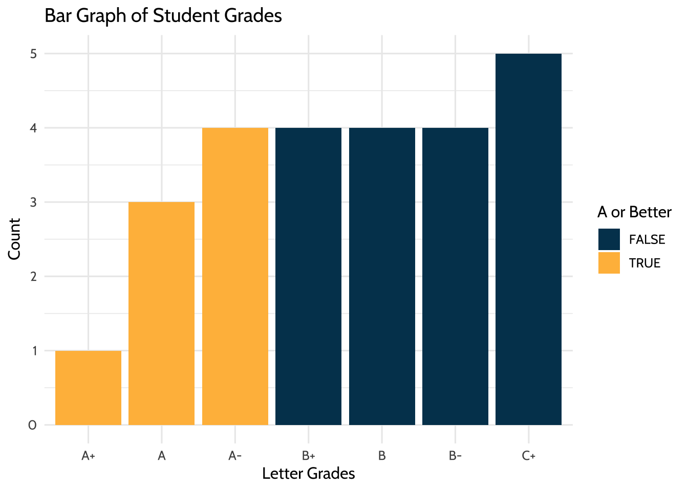
Figure 8.1: Bar Graph of Student Grades
Using {ggplot2}, we can create many types of graphs. Using classwork_df from earlier, we can see the distribution of scores and how they differ from classwork to classwork using boxplots. We are able to do this because we have made the classworks and scores columns tidy. Like before, we can change the factor levels of classwork_number so that they are in an order that is more easily understandable when viewing the plot.
# Boxplot of continuous variable
classwork_df %>%
  mutate(classwork_number =
           factor(classwork_number, levels = c("classwork_1",
                                               "classwork_2",
                                               "classwork_3",
                                               "classwork_4",
                                               "classwork_5",
                                               "classwork_6",
                                               "classwork_7",
                                               "classwork_8",
                                               "classwork_9",
                                               "classwork_10",
                                               "classwork_11",
                                               "classwork_12",
                                               "classwork_13",
                                               "classwork_14",
                                               "classwork_15",
                                               "classwork_16",
                                               "classwork_17"))) %>%
  ggplot(aes(x = classwork_number,
             y = score,
             fill = classwork_number)) +
  geom_boxplot(fill = dataedu_colors("yellow")) +
  labs(title = "Distribution of Classwork Scores",
       x = "Classwork",
       y = "Scores") +
  theme_dataedu() +
  theme(
    # removes legend
    legend.position = "none",
    # angles the x axis labels
    axis.text.x = element_text(angle = 45, hjust = 1)
    )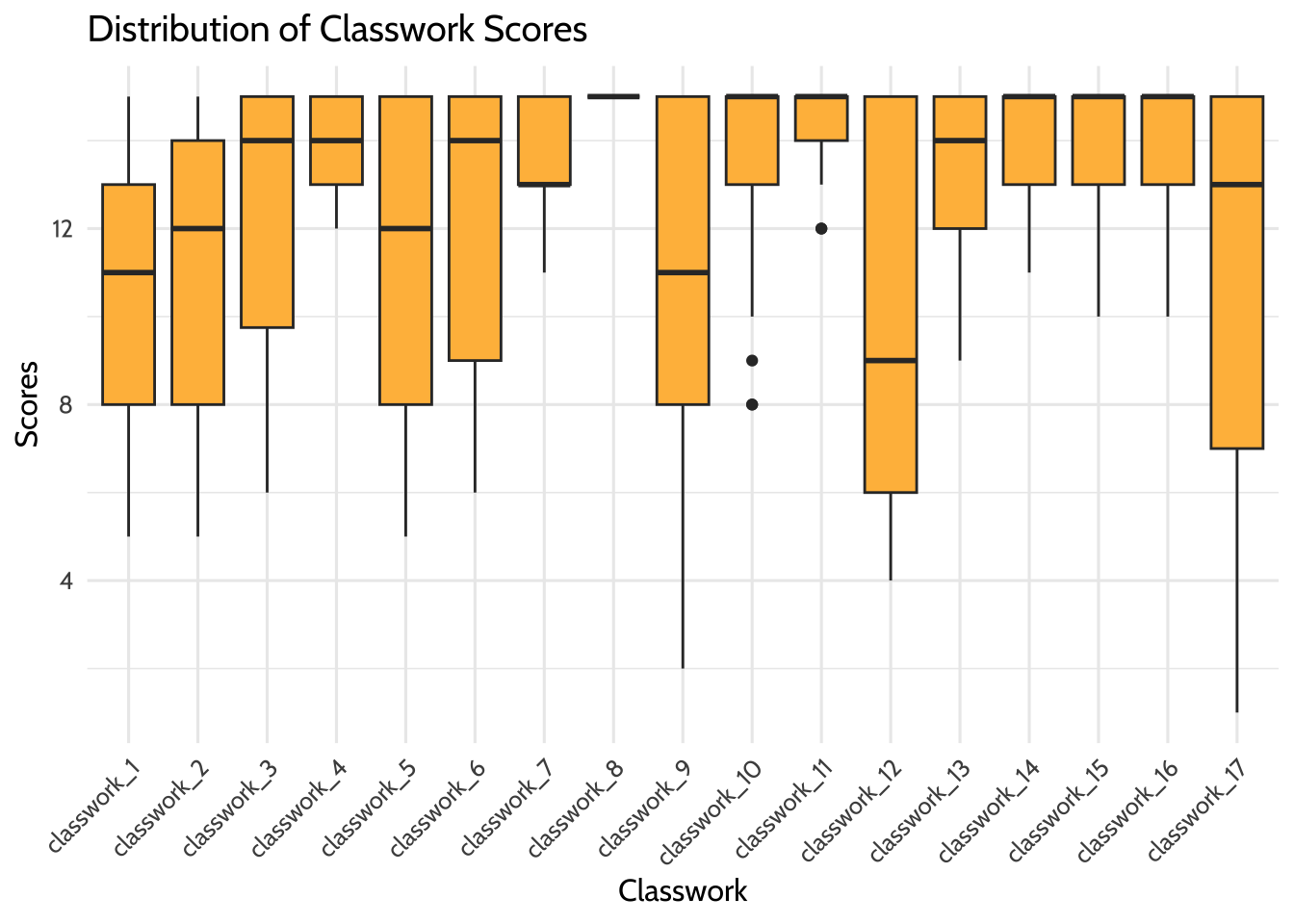
Figure 8.2: Distribution of Classwork Scores
8.8.2 Model data
8.8.2.1 Deciding on an analysis
Using this spreadsheet, we can start to form hypotheses about the data. For example, we can ask ourselves, “Can we predict overall grade using formative assessment scores?” For this, we will try to predict a response variable Y (overall grade) as a function of a predictor variable X (formative assessment scores). The goal is to create a mathematical equation for overall grade as a function of formative assessment scores when only formative assessment scores are known.
8.8.2.2 Visualize data to check assumptions
It’s important to visualize data to see any distributions, trends, or patterns before building a model. We use {ggplot2} to understand these variables graphically.
8.8.2.3 Linearity
First, we plot X and Y to determine if we can see a linear relationship between the predictor and response. The x-axis shows the formative assessment scores while the y-axis shows the overall grades. The graph suggests a correlation between overall class grade and formative assessment scores. As the formative scores goes up, so does the overall grade.
# Scatterplot between formative assessment and grades by percent
# To determine linear relationship
gradebook %>%
  ggplot(aes(x = formative_assessments,
             y = running_average)) +
  geom_point(color = dataedu_colors("green")) +
  labs(title = "Relationship Between Overall Grade and Formative Assessments",
       x = "Formative Assessment Score",
       y = "Overall Grade in Percentage") +
  theme_dataedu()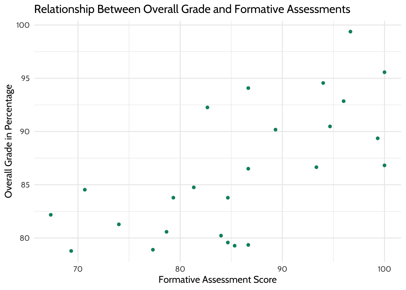
Figure 8.3: Relationship Between Overall Grade and Formative Assessments
We can layer different types of plots on top of each other in {ggplot2}. Here the scatterplot is layered with a line of best fit, suggesting a positive linear relationship.
# Scatterplot between formative assessment and grades by percent
# To determine linear relationship
# With line of best fit
gradebook %>%
  ggplot(aes(x = formative_assessments,
             y = running_average)) +
  geom_point(color = dataedu_colors("green")) +
  geom_smooth(method = "lm",
              se = TRUE) +
  labs(title = "Relationship Between Overall Grade and Formative Assessments",
       x = "Formative Assessment Score",
       y = "Overall Grade in Percentage") +
  theme_dataedu()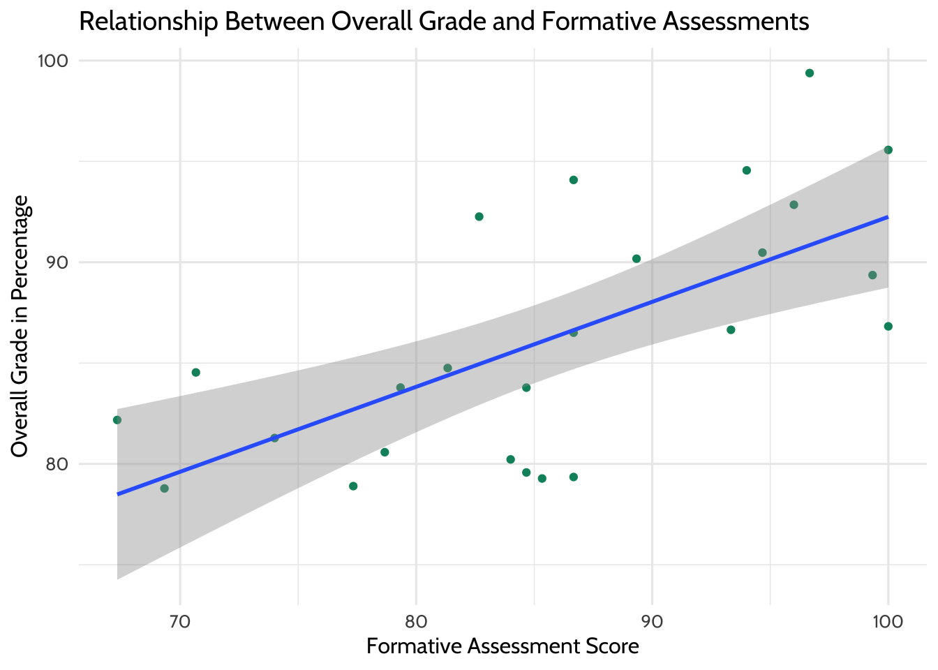
Figure 8.4: Relationship Between Overall Grade and Formative Assessments (with Line of Best Fit)
8.8.2.4 Outliers
Now we use boxplots to determine if there are any outliers in the formative assessment scores or overall grades. As we would like to conduct a linear regression, we’re hoping to see no outliers in the data. We don’t see any for these two variables, so we can proceed with the model.
# Boxplot of formative assessment scores
# To determine if there are any outliers
gradebook %>%
  ggplot(aes(x = "",
             y = formative_assessments)) +
  geom_boxplot(fill = dataedu_colors("yellow")) +
  labs(title = "Distribution of Formative Assessment Scores",
       x = "Formative Assessment",
       y = "Score") +
  theme_dataedu()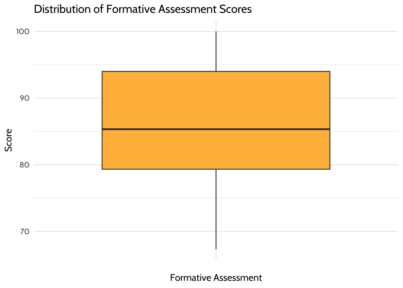
Figure 8.5: Distribution of Formative Assessment Scores
# Boxplot of overall grade scores in percentage
# To determine if there are any outliers
gradebook %>%
  ggplot(aes(x = "",
             y = running_average)) +
  geom_boxplot(fill = dataedu_colors("yellow")) +
  labs(title = "Distribution of Overall Grade Scores",
       x = "Overall Grade",
       y = "Score in Percentage") +
  theme_dataedu()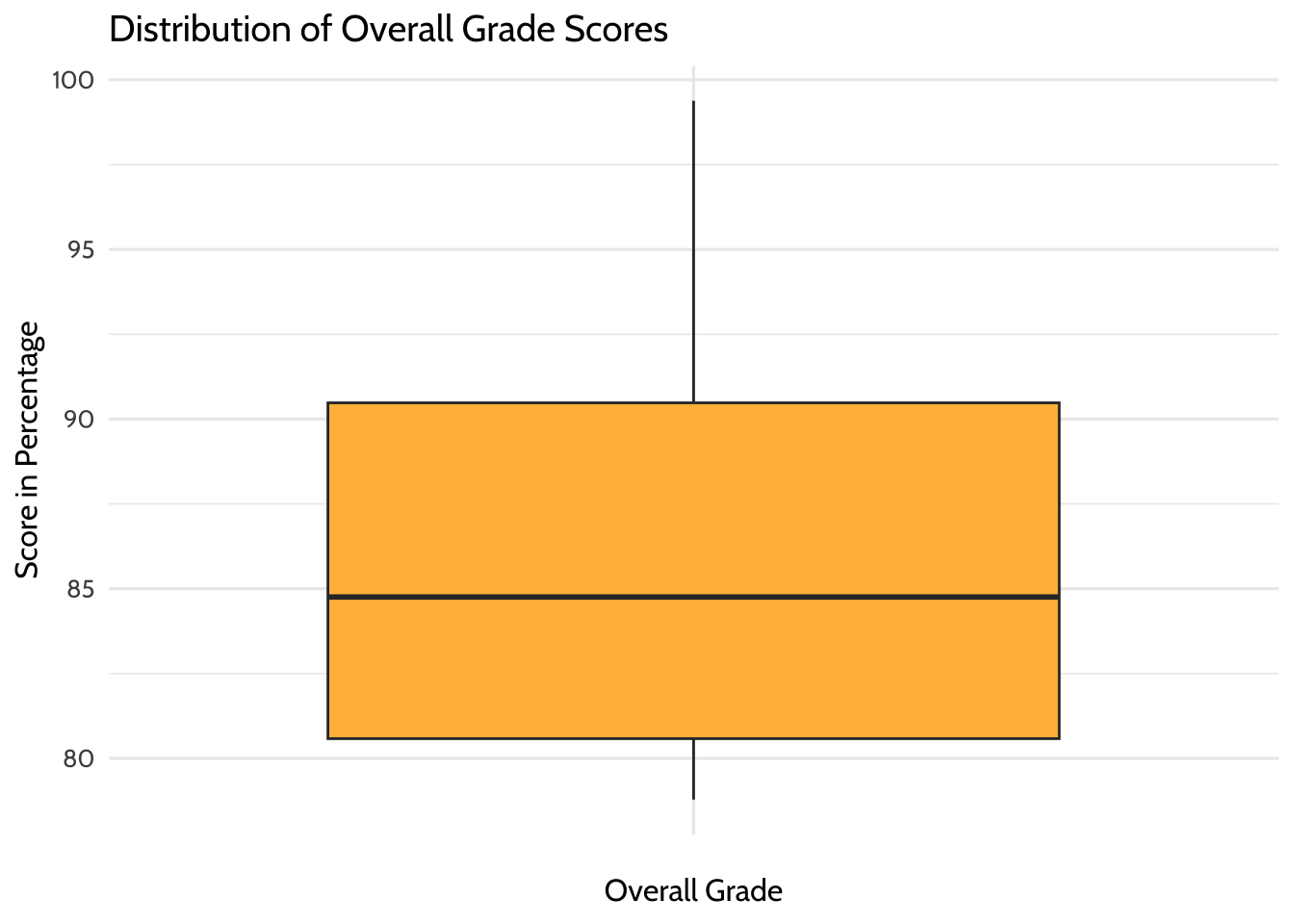
Figure 8.6: Distribution of Overall Grade Scores
8.8.3 Correlation analysis
We want to know the strength of the relationship between the two variables, formative assessment scores and overall grade percentage. The strength is denoted by the “correlation coefficient”. The correlation coefficient goes from –1 to 1. If one variable consistently increases with the increasing value of the other, then they have a positive correlation (towards 1). If one variable consistently decreases with the increasing value of the other, then they have a negative correlation (towards –1). If the correlation coefficient is 0, then there is no relationship between the two variables.
Correlation is good for finding relationships but it does not imply that one variable causes the other (correlation does not mean causation).
## [1] 0.6638.9 Results
In Chapter 7, we introduced the concept of linear models. Let’s use that same technique here. Now that you’ve checked your assumptions and seen a linear relationship, we can build a linear model—a mathematical formula that calculates your running average as a function of your formative assessment score. This is done using the lm() function, where the arguments are:
- Your predictor (
formative_assessments) - Your response (
running_average) - The data (
gradebook)
lm() is available in “base R”—that is, no additional packages beyond what is loaded with R automatically are necessary.
##
## Call:
## lm(formula = running_average ~ formative_assessments, data = gradebook)
##
## Residuals:
##    Min     1Q Median     3Q    Max
## -7.281 -2.793 -0.013  3.318  8.535
##
## Coefficients:
##                       Estimate Std. Error t value Pr(>|t|)
## (Intercept)            50.1151     8.5477    5.86  5.6e-06 ***
## formative_assessments   0.4214     0.0991    4.25    3e-04 ***
## ---
## Signif. codes:  0 '***' 0.001 '**' 0.01 '*' 0.05 '.' 0.1 ' ' 1
##
## Residual standard error: 4.66 on 23 degrees of freedom
## Multiple R-squared:  0.44,   Adjusted R-squared:  0.416
## F-statistic: 18.1 on 1 and 23 DF,  p-value: 0.000302
When you fit a model to two variables, you create an equation that describes the relationship between them based on their averages. This equation uses the (Intercept), which is 50.11511, and the coefficient for formative_assessments, which is 0.42136. The equation reads like this:
running_average = 50.11511 + 0.42136*formative_assessmentsWe interpret these results by saying, “For every one unit increase in formative assessment scores, we can expect a 0.421 unit increase in running average scores”. This equation estimates the relationship between formative assessment scores and running average scores in the student population. Think of it as an educated guess about any one particular student’s running average, if all you had was their formative assessment scores.
8.9.1 More on interpreting models
Challenge yourself to apply your education knowledge to the way you communicate a model’s output to your audience. Consider the difference between describing the relationship between formative assessment scores and running averages for a large group of students and for an individual student.
If you were describing the formative assessment system to stakeholders, you might say something like, “We can generally expect our students to show a 0.421 increase in their running average score for every one point increase in their formative assessment scores”. That makes sense because your goal is to explain what happens in general.
But we can rarely expect every prediction about individual students to be correct, even with a reliable model. So when using this equation to inform how you support an individual student, it’s important to consider all the real-life factors, visible and invisible, that influence an individual student outcome.
To illustrate this concept, consider predicting how long it takes for you to run around the block right outside your office. Imagine you ran around the block five times and after each lap you jotted your time down on a post-it. After the fifth lap, you do a calculation on your cell phone and see that your average lap time is five minutes. If you were to guess how long your sixth lap would take, you’d be smart to guess five minutes. But intuitively you know there’s no guarantee the sixth lap time will land right on your average. Maybe you’ll trip on a crack in the sidewalk and lose a few seconds, or maybe your favorite song pops into your head and gives you a 30-second advantage. Statisticians would call the difference between your predicted lap time and your actual lap time a “residual” value. Residuals are the differences between predicted values and actual values that aren’t explained by your linear model equation.
It takes practice to interpret and communicate these concepts well. A good start is exploring model outputs in two contexts: first, as a general description of a population and, second, as a practical tool for helping individual student performance.
8.10 Conclusion
This walkthrough chapter followed the basic steps of a data analysis project. We first imported our data, then cleaned and transformed it. Once we had the data in a tidy format, we were able to explore it using data visualization before modeling it using linear regression. Imagine that you ran this analysis for someone else: a teacher or an administrator in a school. In such cases, you might be interested in sharing the results in the form of a report or document. Thus, the only remaining step in this analysis would be to communicate our findings using a tool such as R Markdown (https://rmarkdown.rstudio.com/). While we do not discuss R Markdown in this book, we note that it provides the functionality to easily generate reports that include both text (like the words you just read) and code, and the output from code, which are displayed together in a single document (PDF, Word, HTML, and other formats).
While we began to explore models in this walkthrough, we will continue to discuss analyses and statistical modeling in more detail in later chapters (i.e., Chapter 9 on aggregate data, Chapter 10 on longitudinal analyses, Chapter 13 on multi-level models, and Chapter 14 on random forest machine learning models).