10 Walkthrough 4: Longitudinal analysis with federal students with disabilities data
Abstract
This chapter explores cleaning, visualizing, and modeling aggregate data. Data scientists in education frequently work with public aggregate data when student level data is not available. By analyzing aggregate datasets, data scientists in education uncover context for other analyses. Using a freely available federal government dataset, this chapter compares the number of female and male students in special education over time in the United States. Analysis on this scale provides useful context for district and school level analysis. It encourages questions about the experiences of students in special education at the local level by offering a basis for comparison at a national level. Data science tools in this chapter include importing data, preparing data for analysis, visualizing data, and selecting plots for communicating results.
10.1 Topics emphasized
- Importing data
- Tidying data
- Transforming data
- Visualizing data
- Modeling data
- Communicating results
10.2 Functions introduced
list.files()download.file()lubridate::ymd()identical()dplyr::top_n()ggplot2::geom_jitter()dplyr::arrange()
10.3 Vocabulary
- aggregate data
- file path
- list
- read in
- tidy format
- statistical model
- student-level data
- longitudinal analysis
- ratio
- subset
- vector
10.4 Chapter overview
Data scientists working in education don’t always have access to student level data, so knowing how to model publicly available datasets, as in the previous chapter, is a useful skill. This walkthrough builds upon and extends the focus on aggregate data in the last chapter to focus on a change over time in students with disabilities in each state. We note that analyses that involve time can go by a number of names, such as longitudinal analyses or time series analyses, or—less formally—analyses or studies of change over time.
Here, we primarily use the term longitudinal analysis to refer to analyses of data at multiple time points. While data from two time points would be included in this definition, our emphasis is on data from a greater number of time points, which can reveal more nuance in how change over time is happening.
10.4.1 Background
In this chapter, we’ll be learning some ways to explore data over time. In addition, we’ll be learning some techniques for exploring a publicly available dataset. Like most public datasets (see the previous chapter), this one contains aggregate data. This means that someone totaled up the student counts so that it doesn’t reveal any private information.
You can download the datasets for this walkthrough on the United States Department of Education website (see Department of Education (2020))2; though they are also available in the {dataedu} package that accompanies this book, as we describe in the “Importing the Data From the {dataedu} Package” section below.
10.5 Load packages
The function here() from the {here} package can cause conflicts with other functions called here(). We can prevent problems by loading that package last and including the package name for every call to here(), like this: here::here(). This is called “including the namespace”.
If you have not installed any of these packages, then you will need to do so, first, using the install.packages() function; see the “Packages” section of the “Foundational Skills” chapter for instructions (and an overview of what packages are and how they work).
You can load the packages needed in this walkthrough by running this code:
10.6 Import data
In this analysis we’ll be importing and combining six datasets that describe the
number of students with disabilities in a given year. Let’s spend some time
carefully reviewing how to get the .csv files we’ll need downloaded and stored
on your computer. If you want to run the code exactly as written here, you’ll
need to store the same datasets in the right location. As an alternate, we make these data files that are used in the walkthrough—like those in other walkthroughs—available through the {dataedu} package. Last, we note that while it’s possible to use this
walkthrough on different datasets or to store them in different locations on
your computer, you’ll need to make adjustments to your code based on the
datasets you used and where you stored them. We suggest only doing this if you
already have some experience using R.
10.6.1 What to download
In this walkthrough, we’ll be using six separate datasets of child counts, one for each year between 2012 and 2017. If you’re copying and pasting the code in this walkthrough, we recommend downloading the datasets from our GitHub repository for the most reliable results. As we note above, you can also access this data after they have been merged via the {dataedu} package; see the “Importing the Data From the {dataedu} Package” section of this chapter. Here’s a link to each file; we also include a short URL via the URL-shortener website bit.ly:
2012 data (https://github.com/data-edu/data-science-in-education/raw/master/data/longitudinal_data/bchildcountandedenvironments2012.csv) (https://bit.ly/3dCtVtf)
2013 data (https://github.com/data-edu/data-science-in-education/raw/master/data/longitudinal_data/bchildcountandedenvironments2013.csv) (https://bit.ly/33WXnFX)
2014 data (https://github.com/data-edu/data-science-in-education/raw/master/data/longitudinal_data/bchildcountandedenvironments2014.csv) (https://bit.ly/2UvSwbx)
2015 data (https://github.com/data-edu/data-science-in-education/raw/master/data/longitudinal_data/bchildcountandedenvironments2015.csv) (https://bit.ly/39wQAUg)
2016 data (https://github.com/data-edu/data-science-in-education/raw/master/data/longitudinal_data/bchildcountandedenvironments2016.csv) (https://bit.ly/2JubWHC)
2017 data (https://github.com/data-edu/data-science-in-education/raw/master/data/longitudinal_data/bchildcountandedenvironments2017-18.csv) (https://bit.ly/2wPLu8w)
You can also find these files on the United States Department of Education website (https://www2.ed.gov/programs/osepidea/618-data/state-level-data-files/index.html)
10.6.2 A note on file paths
When you download these files, be sure to store them in a folder in your working
directory. To get to the data in this walkthrough, we can use this file path
in our working directory: “data/longitudinal_data”. We’ll be using the here() function from the {here}
package, which conveniently fills in all the folders in the file path of your
working directory all the way up to the folders you specify in the arguments. So,
when referencing the file path “data/longitudinal_data”, we’ll use code like
this:
You can use a different file path if you like, just take note of where your downloaded files are so you can use the correct file path when writing your code to import the data.
10.6.3 How to download the files
One way to download the files is manually, saving them to a working directory.
Another way is to read them directly into R, using the download.file() function,
and the same file path described in the previous section. This functionality works for any CSV files that you can download from webpages; the key is that the URL must be to the CSV file itself (one way to check is to ensure that the URL ends in .csv).
Here is how we would do it for the first dataset (from the year 2012), using the shortened URLs included along with the full URLs above.
download.file(
  # the url argument takes a URL for a CSV file
  url = 'https://bit.ly/3dCtVtf',
  # destfile specifies where the file should be saved
  destfile = here::here("data",
           "longitudinal_data",
           "bchildcountandedenvironments2012.csv"),
  mode = "wb")
We can do this for the remaining five datasets:
download.file(
  url = 'https://bit.ly/33WXnFX',
  destfile = here::here("data",
           "longitudinal_data",
           "bchildcountandedenvironments2013.csv"),
  mode = "wb")

download.file(
  url = 'https://bit.ly/2UvSwbx',
  destfile = here::here("data",
           "longitudinal_data",
           "bchildcountandedenvironments2014.csv"),
  mode = "wb")

download.file(
  url = 'https://bit.ly/39wQAUg',
  destfile = here::here("data",
           "longitudinal_data",
           "bchildcountandedenvironments2015.csv"),
  mode = "wb")

download.file(
  url = 'https://bit.ly/2JubWHC',
  destfile = here::here("data",
           "longitudinal_data",
           "bchildcountandedenvironments2016.csv"),
  mode = "wb")

download.file(
  url = 'https://bit.ly/2wPLu8w',
  destfile = here::here("data",
           "longitudinal_data",
           "bchildcountandedenvironments2017-18.csv"),
  mode = "wb")
Now that the files are downloaded (either through the above code or from GitHub), we’re ready to proceed to reading the data into R. If you were unable to download these files for any reason, they are also available through the {dataedu} package, as we describe after the “Reading in Many Datasets” section.
10.6.4 Reading in one dataset
We’ll be learning how to read in more than one dataset using the map()
function. Let’s try it first with one dataset, then we’ll scale our solution up
to multiple datasets. When you are analyzing multiple datasets that all have the
same structure, you can read in each dataset using one code chunk. This code
chunk will store each dataset as an element of a list.
Before doing that, you should explore one of the datasets to see what you can learn about its structure. Clues from this exploration inform how you read in all the datasets at once later on. For example, we can see that the first dataset has some lines at the top that contain no data:
## # A tibble: 16,234 × 31
##    `Extraction Date:` `6/12/2013` ...3       ...4  ...5  ...6  ...7  ...8  ...9
##    <chr>              <chr>       <chr>      <chr> <chr> <chr> <chr> <chr> <chr>
##  1 Updated:           2/12/2014   <NA>       <NA>  <NA>  <NA>  <NA>  <NA>  <NA>
##  2 Revised:           <NA>        <NA>       <NA>  <NA>  <NA>  <NA>  <NA>  <NA>
##  3 <NA>               <NA>        <NA>       <NA>  <NA>  <NA>  <NA>  <NA>  <NA>
##  4 Year               State Name  SEA Educa… SEA … Amer… Asia… Blac… Hisp… Nati…
##  5 2012               ALABAMA     Correctio… All … -     -     -     -     -
##  6 2012               ALABAMA     Home       All … 1     1     57    12    0
##  7 2012               ALABAMA     Homebound… All … -     -     -     -     -
##  8 2012               ALABAMA     Inside re… All … -     -     -     -     -
##  9 2012               ALABAMA     Inside re… All … -     -     -     -     -
## 10 2012               ALABAMA     Inside re… All … -     -     -     -     -
## # ℹ 16,224 more rows
## # ℹ 22 more variables: ...10 <chr>, ...11 <chr>, ...12 <chr>, ...13 <chr>,
## #   ...14 <chr>, ...15 <chr>, ...16 <chr>, ...17 <chr>, ...18 <chr>,
## #   ...19 <chr>, ...20 <chr>, ...21 <chr>, ...22 <chr>, ...23 <chr>,
## #   ...24 <chr>, ...25 <chr>, ...26 <chr>, ...27 <chr>, ...28 <chr>,
## #   ...29 <chr>, ...30 <chr>, ...31 <chr>
The rows containing “Extraction Date:”, “Updated:”, and “Revised:” aren’t actually rows. They’re notes the authors left at the top of the dataset to show when the dataset was changed.
read_csv() uses the first row as the variable names unless told otherwise, so
we need to tell read_csv() to skip those lines using the skip argument. If
we don’t, read_csv() assumes the very first line—the one that says
“Extraction Date:”—is the correct row of variable names. That’s why calling
read_csv() without the skip argument results in column names like X4. When
there’s no obvious column name to read in, read_csv() names them X[...] and
lets you know in a warning message.
Try using skip = 4 in your call to read_csv():
read_csv(here::here(
  "data",
  "longitudinal_data",
  "bchildcountandedenvironments2012.csv"
),
skip = 4)
## # A tibble: 16,230 × 31
## Year `State Name` `SEA Education Environment` SEA Disability Categ…¹
## <chr> <chr> <chr> <chr>
## 1 2012 ALABAMA Correctional Facilities All Disabilities
## 2 2012 ALABAMA Home All Disabilities
## 3 2012 ALABAMA Homebound/Hospital All Disabilities
## 4 2012 ALABAMA Inside regular class 40% through 7… All Disabilities
## 5 2012 ALABAMA Inside regular class 80% or more o… All Disabilities
## 6 2012 ALABAMA Inside regular class less than 40%… All Disabilities
## 7 2012 ALABAMA Other Location Regular Early Child… All Disabilities
## 8 2012 ALABAMA Other Location Regular Early Child… All Disabilities
## 9 2012 ALABAMA Parentally Placed in Private Schoo… All Disabilities
## 10 2012 ALABAMA Residential Facility, Age 3-5 All Disabilities
## # ℹ 16,220 more rows
## # ℹ abbreviated name: ¹`SEA Disability Category`
## # ℹ 27 more variables: `American Indian or Alaska Native Age 3 to 5` <chr>,
## # `Asian Age 3-5` <chr>, `Black or African American Age 3-5` <chr>,
## # `Hispanic/Latino Age 3-5` <chr>,
## # `Native Hawaiian or Other Pacific Islander Age 3-5` <chr>,
## # `Two or More Races Age 3-5` <chr>, `White Age 3-5` <chr>, …The skip argument told read_csv() to make the line containing “Year”, “State
Name”, and so on as the first line. The result is a dataset that has “Year”,
“State Name”, and so on as variable names.
10.6.5 Reading in many datasets
Will the read_csv() and skip = 4 combination work on all our datasets? To
find out, we’ll use this strategy:
- Store a vector of filenames and paths in a list. These paths point to our datasets
- Pass the list of filenames as arguments to
read_csv()usingpurrr::map(), includingskip = 4, in ourread_csv()call - Examine the new list of datasets to see if the variable names are correct
Imagine a widget-making machine that works by acting on raw materials it receives on a conveyer belt. This machine executes one set of instructions on each of the raw materials it receives. You are the operator of the machine and you design instructions to get a widget out of the raw materials. Your plan might look something like this:
- Raw materials: a list of filenames and their paths
- Widget-making machine:
purrr:map() - Widget-making instructions: `read_csv(path, skip = 4)
- Expected widgets: a list of datasets
Let’s create the raw materials first. Our raw materials will be file paths to
each of the CSVs we want to read. Use list.files to make a vector of filename
paths and name that vector filenames. list.files returns a vector of file
names in the folder specified in the path argument. When we set the
full.names argument to “TRUE”, we get a full path of these filenames. This
will be useful later when we need the file names and their paths to read our
data in.
# Get filenames from the data folder
filenames <-
  list.files(path = here::here("data", "longitudinal_data"),
             full.names = TRUE)

# A list of filenames and paths
filenames
That made a vector of six filenames, one for each year of child count data
stored in the data folder. Now pass our raw materials, the vector called
filenames, to our widget-making machine called map() and give the machine
the instructions read_csv(., skip = 4). Name the list of widgets it cranks out
all_files:
# Pass filenames to map and read_csv
all_files <-
  filenames %>%
  # Apply the function read_csv to each element of filenames
  map(., ~ read_csv(., skip = 4))
It is important to think ahead here. The goal is to combine the datasets in
all_files into one dataset using bind_rows(). But that will only work if all
the datasets in our list have the same number of columns and the same column
names. We can check our column names by using map() and names():
We can use identical() to see if the variables from two datasets match. We see
that the variable names of the first and second datasets don’t match, but the
variables from the second and third do.
# Variables of first and second dataset don't match
identical(names(all_files[[1]]), names(all_files[[2]]))
## [1] FALSE## [1] TRUEAnd we can check the number of columns by using map() and ncol():
## [[1]]
## [1] 31
##
## [[2]]
## [1] 50
##
## [[3]]
## [1] 50
##
## [[4]]
## [1] 50
##
## [[5]]
## [1] 50
##
## [[6]]
## [1] 50
We have just encountered an extremely common problem in education data!
Neither the number of columns nor the column names match.
This is a problem because—with different column names—we won’t be able to combine the datasets in a later step.
As we can see, when we try, bind_rows() returns a dataset with 100 columns, instead of the
expected 50.
# combining the datasets at this stage results in the incorrect
# number of columns
bind_rows(all_files) %>%
  # check the number of columns
  ncol()
## [1] 100We’ll correct this in the next section by selecting and renaming our variables, but it’s good to notice this problem early in the process so you know to work on it later.
10.6.6 Loading the data from {dataedu}
After all of the hard work we’ve done above, it may seem painful to simply read in the final result! But,
if you were unable to download the files because you do not have Internet access (or for any other reason!), you can read in the all_files list of six data frames through the {dataedu} package with the following line of code:
10.7 Process data
Transforming your dataset before visualizing it and fitting models is critical. It’s easier to write code when variable names are concise and informative. Many functions in R, especially those in the {ggplot2} package, work best when datasets are in a “tidy” format. It’s easier to do an analysis when you have just the variables you need. Any unused variables can confuse your thought process.
Let’s preview the steps we’ll be taking:
- Fix the variable names in the 2016 data
- Combine the datasets
- Pick variables
- Filter for the desired categories
- Rename the variables
- Standardize the state names
- Transform the column formats from wide to long using
pivot_longer - Change the data types of variables
- Explore
NA’s
In real life, data scientists don’t always know the cleaning steps until they dive into the work. Learning what cleaning steps are needed requires exploration, trial and error, and clarity on the analytic questions you want to answer.
After a lot of exploring, we settled on these steps for this analysis. When you do your own, you will find different things to transform. As you do more and more data analysis, your instincts for what to transform will improve.
10.7.1 Fix the variable names in the 2016 data
When we print the 2016 dataset, we notice that the variable names are incorrect.
Let’s verify that by looking at the first ten variable names of the 2016
dataset, which is the fifth element of all_files:
##  [1] "2016"                    "Alabama"
##  [3] "Correctional Facilities" "All Disabilities"
##  [5] "-...5"                   "-...6"
##  [7] "-...7"                   "-...8"
##  [9] "-...9"                   "-...10"
We want the variable names to be Year and State Name, not 2016 and
Alabama. But first, let’s go back and review how to get at the 2016 dataset
from all_files. We need to identify which element the 2016 dataset was in the
list. The order of the list elements was set all the way back when we fed
map() our list of filenames. If we look at filenames again, we see that its
fifth element is the 2016 dataset. Try looking at the first and fifth elements
of filenames:
Once we know the 2016 dataset is the fifth element of our list, we can pluck it out by using double brackets:
## # A tibble: 16,230 × 50
##    `2016` Alabama `Correctional Facilities`   `All Disabilities` `-...5` `-...6`
##    <chr>  <chr>   <chr>                       <chr>              <chr>   <chr>
##  1 2016   Alabama Home                        All Disabilities   43      30
##  2 2016   Alabama Homebound/Hospital          All Disabilities   -       -
##  3 2016   Alabama Inside regular class 40% t… All Disabilities   -       -
##  4 2016   Alabama Inside regular class 80% o… All Disabilities   -       -
##  5 2016   Alabama Inside regular class less … All Disabilities   -       -
##  6 2016   Alabama Parentally Placed in Priva… All Disabilities   -       -
##  7 2016   Alabama Residential Facility, Age … All Disabilities   5       3
##  8 2016   Alabama Residential Facility, Age … All Disabilities   -       -
##  9 2016   Alabama Separate Class              All Disabilities   58      58
## 10 2016   Alabama Separate School, Age 3-5    All Disabilities   11      20
## # ℹ 16,220 more rows
## # ℹ 44 more variables: `-...7` <chr>, `-...8` <chr>, `-...9` <chr>,
## #   `-...10` <chr>, `-...11` <chr>, `-...12` <chr>, `-...13` <chr>,
## #   `-...14` <chr>, `-...15` <chr>, `-...16` <chr>, `-...17` <chr>,
## #   `-...18` <chr>, `-...19` <chr>, `0...20` <chr>, `0...21` <chr>,
## #   `0...22` <chr>, `0...23` <chr>, `0...24` <chr>, `0...25` <chr>,
## #   `0...26` <chr>, `0...27` <chr>, `0...28` <chr>, `1...29` <chr>, …
We used skip = 4 when we read in the datasets in the list. That worked for all
datasets except the fifth one. In that one, skipping four lines left out the
variable name row. To fix it, we’ll read the 2016 dataset again using
read_csv() and the fifth element of filenames but this time will use the
argument skip = 3. We’ll assign the newly read dataset to the fifth element of
the all_files list:
all_files[[5]] <-
  # Skip the first 3 lines instead of the first 4
  read_csv(filenames[[5]], skip = 3)
Try printing all_files now. You can confirm we fixed the problem by checking
that the variable names are correct.
10.7.2 Pick variables
Now that we know all our datasets have the correct variable names, we simplify our datasets by picking the variables we need. This is a good place to think carefully about which variables to pick. This usually requires a fair amount of trial and error, but here is what we found we needed:
- Our analytic questions are about gender, so let’s pick the gender variable
- Later, we’ll need to filter our dataset by disability category and program
location so we’ll want
SEA Education EnvironmentandSEA Disability Category - We want to make comparisons by state and reporting year, so we’ll also pick
State NameandYear
Combining select() and contains() is a convenient way to pick these
variables without writing a lot of code. Knowing that we want variables that
contain the acronym “SEA” and variables that contain “male” in their names, we
can pass those characters to contains():
all_files[[1]] %>%
  select(
    Year,
    contains("State", ignore.case = FALSE),
    contains("SEA", ignore.case = FALSE),
    contains("male")
  )
## # A tibble: 16,230 × 8
## Year `State Name` `SEA Education Environment` SEA Disability Categ…¹
## <chr> <chr> <chr> <chr>
## 1 2012 ALABAMA Correctional Facilities All Disabilities
## 2 2012 ALABAMA Home All Disabilities
## 3 2012 ALABAMA Homebound/Hospital All Disabilities
## 4 2012 ALABAMA Inside regular class 40% through 7… All Disabilities
## 5 2012 ALABAMA Inside regular class 80% or more o… All Disabilities
## 6 2012 ALABAMA Inside regular class less than 40%… All Disabilities
## 7 2012 ALABAMA Other Location Regular Early Child… All Disabilities
## 8 2012 ALABAMA Other Location Regular Early Child… All Disabilities
## 9 2012 ALABAMA Parentally Placed in Private Schoo… All Disabilities
## 10 2012 ALABAMA Residential Facility, Age 3-5 All Disabilities
## # ℹ 16,220 more rows
## # ℹ abbreviated name: ¹`SEA Disability Category`
## # ℹ 4 more variables: `Female Age 3 to 5` <chr>, `Male Age 3 to 5` <chr>,
## # `Female Age 6 to 21` <chr>, `Male Age 6 to 21` <chr>That code chunk verifies that we got the variables we want, so now we will turn
the code chunk into a function called pick_vars(). We will then use map() to
apply pick_vars() to each dataset of our list, all_files, to the function.
In this function, we’ll use a special version of select() called
select_at(), which conveniently picks variables based on criteria we give it.
The argument vars(Year, contains("State", ignore.case = FALSE), contains("SEA", ignore.case = FALSE), contains("male")) tells R we want to keep any column
whose name has “State” in upper or lower case letters, has “SEA” in the title,
and has “male” in the title. This will result in a newly transformed all_files
list that contains six datasets, all with the desired variables.
10.7.3 Combine six datasets into one
Now we’ll turn our attention to combining the datasets in our list all_files
into one. We’ll use bind_rows(), which combines datasets by adding each one to
the bottom of the one before it. The first step is to check and see if our
datasets have the same number of variables and the same variable names. When we
use names() on our list of newly changed datasets, we see that each dataset’s
variable names are the same:
## [[1]]
## [1] "Year"                      "State Name"
## [3] "SEA Education Environment" "SEA Disability Category"
## [5] "Female Age 3 to 5"         "Male Age 3 to 5"
## [7] "Female Age 6 to 21"        "Male Age 6 to 21"
##
## [[2]]
## [1] "Year"                      "State Name"
## [3] "SEA Education Environment" "SEA Disability Category"
## [5] "Female Age 3 to 5"         "Male Age 3 to 5"
## [7] "Female Age 6 to 21"        "Male Age 6 to 21"
##
## [[3]]
## [1] "Year"                      "State Name"
## [3] "SEA Education Environment" "SEA Disability Category"
## [5] "Female Age 3 to 5"         "Male Age 3 to 5"
## [7] "Female Age 6 to 21"        "Male Age 6 to 21"
##
## [[4]]
## [1] "Year"                      "State Name"
## [3] "SEA Education Environment" "SEA Disability Category"
## [5] "Female Age 3 to 5"         "Male Age 3 to 5"
## [7] "Female Age 6 to 21"        "Male Age 6 to 21"
##
## [[5]]
## [1] "Year"                      "State Name"
## [3] "SEA Education Environment" "SEA Disability Category"
## [5] "Female Age 3 to 5"         "Male Age 3 to 5"
## [7] "Female Age 6 to 21"        "Male Age 6 to 21"
##
## [[6]]
## [1] "Year"                      "State Name"
## [3] "SEA Education Environment" "SEA Disability Category"
## [5] "Female Age 3 to 5"         "Male Age 3 to 5"
## [7] "Female Age 6 to 21"        "Male Age 6 to 21"
That means that we can combine all six datasets into one using bind_rows().
We’ll call this newly combined dataset child_counts:
Since we know the following, we can conclude that all our rows combined together correctly:
- each of our six datasets had eight variables
- our combined dataset also has eight variables,
But, let’s use str() to verify:
## tibble [97,387 × 8] (S3: tbl_df/tbl/data.frame)
##  $ Year                     : chr [1:97387] "2012" "2012" "2012" "2012" ...
##  $ State Name               : chr [1:97387] "ALABAMA" "ALABAMA" "ALABAMA" "ALABAMA" ...
##  $ SEA Education Environment: chr [1:97387] "Correctional Facilities" "Home" "Homebound/Hospital" "Inside regular class 40% through 79% of day" ...
##  $ SEA Disability Category  : chr [1:97387] "All Disabilities" "All Disabilities" "All Disabilities" "All Disabilities" ...
##  $ Female Age 3 to 5        : chr [1:97387] "-" "63" "-" "-" ...
##  $ Male Age 3 to 5          : chr [1:97387] "-" "174" "-" "-" ...
##  $ Female Age 6 to 21       : chr [1:97387] "4" "-" "104" "1590" ...
##  $ Male Age 6 to 21         : chr [1:97387] "121" "-" "130" "3076" ...
10.7.4 Importing the data from the {dataedu} package
If you would like to load this processed dataset (child_counts), then
you can run the following code to load it directly from the {dataedu} package:
10.7.5 Filter for the desired disabilities and age groups
We want to explore gender related variables, but our dataset has additional
aggregate data for other subgroups. For example, we can use count() to explore
all the different disability groups in the dataset. Here’s the number of times
an SEA Disability Category appears in the dataset:
child_counts %>%
  # count number of times the category appears in the dataset
  count(`SEA Disability Category`)
## # A tibble: 16 × 2
## `SEA Disability Category` n
## <chr> <int>
## 1 All Disabilities 6954
## 2 Autism 6954
## 3 Deaf-blindness 6954
## 4 Developmental delay 4636
## 5 Developmental delay (valid only for children ages 3-9 when defined by … 2318
## 6 Emotional disturbance 6954
## 7 Hearing impairment 6954
## 8 Intellectual disability 6954
## 9 Multiple disabilities 6954
## 10 Orthopedic impairment 6954
## 11 Other health impairment 6954
## 12 Specific learning disability 6954
## 13 Speech or language impairment 6954
## 14 Traumatic brain injury 6954
## 15 Visual impairment 6954
## 16 <NA> 31Since we will be visualizing and modeling gender variables for all students in the dataset, we’ll filter out all subgroups except “All Disabilities” and the age totals:
10.7.6 Rename the variables
In the next section we’ll prepare the dataset for visualization and modeling by “tidying” it. When we write code to transform datasets, we’ll be typing the column names a lot, so it’s useful to change them to ones with more convenient names.
child_counts <-
  child_counts %>%
  rename(
    # change these columns to more convenient names
    year = Year,
    state = "State Name",
    age = "SEA Education Environment",
    disability = "SEA Disability Category",
    f_3_5 = "Female Age 3 to 5",
    m_3_5 = "Male Age 3 to 5",
    f_6_21 = "Female Age 6 to 21",
    m_6_21 = "Male Age 6 to 21"
  )
10.7.7 Clean state names
You might have noticed that some state names in our dataset are in uppercase letters, and some are in lowercase letters:
## # A tibble: 6 × 2
##   state              n
##   <chr>          <int>
## 1 ALABAMA            4
## 2 ALASKA             4
## 3 AMERICAN SAMOA     4
## 4 ARIZONA            4
## 5 ARKANSAS           4
## 6 Alabama            8
If we leave it like this, R will treat state values like “CALIFORNIA” and
“California” as two different states. We can use mutate and tolower to
transform all the state names to lowercase letters.
10.7.8 Tidy the dataset
Visualizing and modeling our data will be much easier if our dataset is in a “tidy” format. In Tidy Data (Wickham, 2014), defines tidy datasets as possessing the following characteristics:
- Each variable forms a column
- Each observation forms a row
- Each type of observational unit forms a table
A note on the gender variable in this dataset
This dataset uses a binary approach to data collection about gender. Students are described as either male or female. The need for an inclusive approach to documenting gender identity is discussed in a paper by Reachable (2016) of The Williams Institute at UCLA.
The gender variables in our dataset are spread across four columns, with each
one representing a combination of gender and age range. We can use
pivot_longer() to bring the gender variable into one column. In this
transformation, we create two new columns: a gender column and a total
column. The total column will contain the number of students in each row’s
gender and age category.
child_counts <-
  child_counts %>%
    pivot_longer(cols = f_3_5:m_6_21,
                 names_to = "gender",
                 values_to = "total")
To make the values of the gender column more intuitive, we’ll use
case_when() to transform the values to either “f” or “m”:
10.7.9 Convert data types
The values in the total column represent the number of students from a
specific year, state, gender, and age group. We know from the chr under their
variable names that R is treating these values like characters instead of
numbers. While R does a decent job of treating numbers like numbers when needed,
it’s much safer to prepare the dataset by changing these character columns to
numeric columns. We’ll use mutate() to change the count columns.
## Warning: There was 1 warning in `mutate()`.
## ℹ In argument: `total = as.numeric(total)`.
## Caused by warning:
## ! NAs introduced by coercion## # A tibble: 2,928 × 6
## year state age disability gender total
## <chr> <chr> <chr> <chr> <chr> <dbl>
## 1 2012 alabama Total, Age 3-5 All Disabilities f 2228
## 2 2012 alabama Total, Age 3-5 All Disabilities m 5116
## 3 2012 alabama Total, Age 3-5 All Disabilities f NA
## 4 2012 alabama Total, Age 3-5 All Disabilities m NA
## 5 2012 alabama Total, Age 6-21 All Disabilities f NA
## 6 2012 alabama Total, Age 6-21 All Disabilities m NA
## 7 2012 alabama Total, Age 6-21 All Disabilities f 23649
## 8 2012 alabama Total, Age 6-21 All Disabilities m 48712
## 9 2012 alaska Total, Age 3-5 All Disabilities f 676
## 10 2012 alaska Total, Age 3-5 All Disabilities m 1440
## # ℹ 2,918 more rowsConverting these count columns from character classes to number classes resulted
in two changes. First, the chr under these variable names has now changed to
dbl, short for “double-precision”. This lets us know that R recognizes these
values as numbers with decimal points. Second, the blank values changed to NA.
When R sees a character class value like "4", it knows to change it to numeric
class 4. But there is no obvious number represented by a value like "" or
-, so it changes it to NA:
## [1] 4## [1] NA## Warning: NAs introduced by coercion## [1] NASimilarly, the variable year needs to be changed from the character format to
the date format. Doing so will make sure R treats this variable like a point in
time when we plot our dataset. The package {lubridate} has a handy function
called ymd that can help us. We just have to use the truncated argument to
let R know we don’t have a month and date to convert.
10.7.10 Explore and address NAs
You’ll notice that some rows in the total column contain an NA. When we used
pivot_longer() to create a gender column, R created unique rows for every
year, state, age, disability, and gender combination. Since the original dataset
had both gender and age range stored in a column like Female Age 3 to 5, R
made rows where the total value is NA . For example, there is no student count
for the age value “Total, Age 3–5” that also has the gender value for female
students who were age 6–21. You can see that more clearly by sorting the dataset
by year, state, and gender.
In our Foundational Skills chapter, we introduced a {dplyr} function called
arrange() to sort the rows of a dataset by the values in a column. Let’s use
arrange() here to sort the dataset by the year, state and gender
columns. When you pass arrange() a variable, it will sort by the order of the
values in that variable. If you pass it multiple variables, arrange() will
sort by the first variable, then by the second, and so on. Let’s see what it
does on child_counts when we pass it the year, state, and gender
variables:
## # A tibble: 2,928 × 6
##    year       state   age             disability       gender total
##    <date>     <chr>   <chr>           <chr>            <chr>  <dbl>
##  1 2012-01-01 alabama Total, Age 3-5  All Disabilities f       2228
##  2 2012-01-01 alabama Total, Age 3-5  All Disabilities f         NA
##  3 2012-01-01 alabama Total, Age 6-21 All Disabilities f         NA
##  4 2012-01-01 alabama Total, Age 6-21 All Disabilities f      23649
##  5 2012-01-01 alabama Total, Age 3-5  All Disabilities m       5116
##  6 2012-01-01 alabama Total, Age 3-5  All Disabilities m         NA
##  7 2012-01-01 alabama Total, Age 6-21 All Disabilities m         NA
##  8 2012-01-01 alabama Total, Age 6-21 All Disabilities m      48712
##  9 2012-01-01 alaska  Total, Age 3-5  All Disabilities f        676
## 10 2012-01-01 alaska  Total, Age 3-5  All Disabilities f         NA
## # ℹ 2,918 more rows
We can simplify our dataset by removing the rows with NA, leaving us with one
row for each category:
- females age 3–5
- females age 6–21
- males age 3–5
- males age 6–21
Each of these categories will be associated with a state and reporting year:
We can verify we have the categories we want by sorting again:
## # A tibble: 1,390 × 6
##    year       state          age             disability       gender total
##    <date>     <chr>          <chr>           <chr>            <chr>  <dbl>
##  1 2012-01-01 alabama        Total, Age 3-5  All Disabilities f       2228
##  2 2012-01-01 alabama        Total, Age 6-21 All Disabilities f      23649
##  3 2012-01-01 alabama        Total, Age 3-5  All Disabilities m       5116
##  4 2012-01-01 alabama        Total, Age 6-21 All Disabilities m      48712
##  5 2012-01-01 alaska         Total, Age 3-5  All Disabilities f        676
##  6 2012-01-01 alaska         Total, Age 6-21 All Disabilities f       5307
##  7 2012-01-01 alaska         Total, Age 3-5  All Disabilities m       1440
##  8 2012-01-01 alaska         Total, Age 6-21 All Disabilities m      10536
##  9 2012-01-01 american samoa Total, Age 3-5  All Disabilities f         45
## 10 2012-01-01 american samoa Total, Age 6-21 All Disabilities f        208
## # ℹ 1,380 more rows
10.8 Analysis
In the last section we focused on importing our dataset. In this section, we will ask, “How have child counts changed over time?” First, we’ll use visualization to explore the number of students in special education over time. In particular, we’ll compare the count of male and female students. Next, we’ll use what we learn from our visualizations to quantify any differences that we see.
10.8.1 Visualize the dataset
Showing this many states in a plot can be overwhelming, so to start we’ll make a
subset of the dataset. We can use a function in the {dplyr} package called
top_n() to help us learn which states have the highest mean count of students
with disabilities:
child_counts %>%
  group_by(state) %>%
  summarize(mean_count = mean(total)) %>%
  # which six states have the highest mean count of students with disabilities
  top_n(6, mean_count)
## # A tibble: 6 × 2
## state mean_count
## <chr> <dbl>
## 1 california 180879.
## 2 florida 92447.
## 3 new york 121751.
## 4 pennsylvania 76080.
## 5 texas 115593.
## 6 us, outlying areas, and freely associated states 1671931.These six states have the highest mean count of students in special education
over the six years we are examining. For reasons we will see in a later
visualization, we are going to exclude outlying areas and freely associated
states. That leaves us with five states: California, Florida, New York,
Pennsylvania, and Texas. We can remove all other states but these by using
filter(). We’ll call this new dataset high_count:
high_count <-
  child_counts %>%
  filter(state %in% c("california", "florida", "new york", "pennsylvania", "texas"))
Now we can use high_count to do some initial exploration. Our analysis is
about comparing counts of male and female students in special education, but
visualization is also a great way to explore related curiosities. You may
surprise yourself with what you find when visualizing your datasets. You might
come up with more interesting hypotheses, find that your initial hypothesis
requires more data transformation, or find interesting subsets of the data—we
saw a little of that in the surprisingly high mean_count of freely associated
states in the state column. Let your curiosity and intuition drive this part
of the analysis. It’s one of the activities that makes data analysis a creative
process.
In that spirit, we’ll start by visualizing specific genders and age groups. Feel free to try these, but also try the other student groups for practice and more exploration.
Start by copying and running this code in your console to see what it does:
high_count %>%
  filter(gender == "f", age == "Total, Age 6-21") %>%
  ggplot(aes(x = year, y = total, color = state)) +
  geom_freqpoly(stat = "identity", size = 1) +
  labs(title = "Count of Female Students in Special Education Over Time",
       subtitle = "Ages 6-21") +
  scale_color_dataedu() +
  theme_dataedu()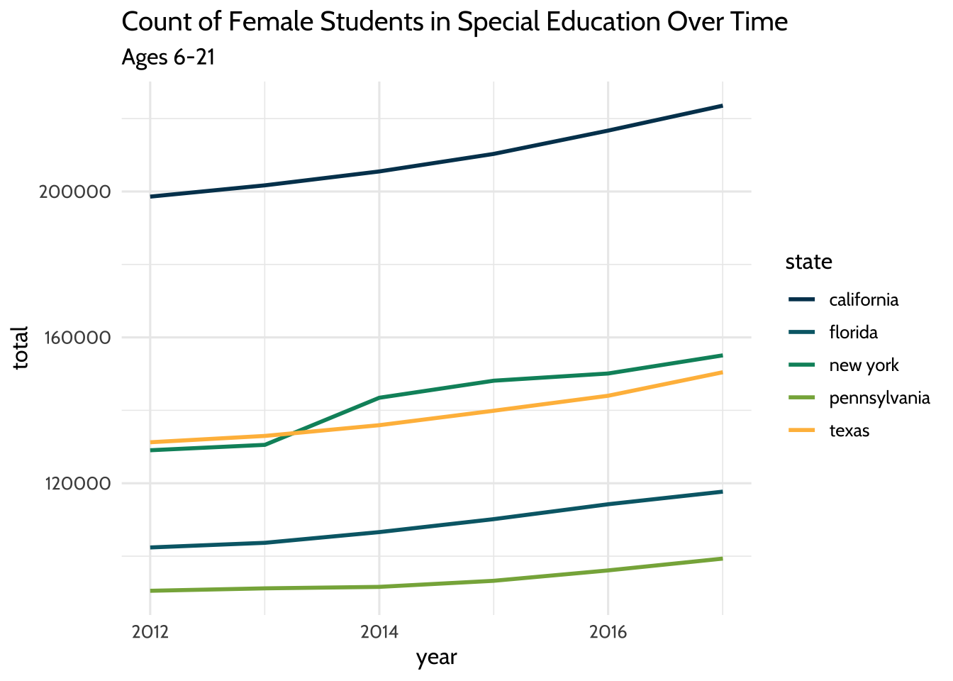
Figure 10.1: Count of Female Students in Special Education Over Time
That gives us a plot that has the years on the x-axis and a count of female students on the y-axis. Each line takes a different color based on the state it represents.
Let’s look at that closer: we used filter() to subset our dataset for students
who are female and ages 6 to 21. We used aes to connect visual elements of our
plot to our data. We connected the x-axis to year, the y-axis to total, and
the color of the line to state.
It’s worth calling out one more thing; since it’s a technique we’ll be using as
we explore further. Note here that, instead of storing our new dataset in a new
variable, we filter the dataset then use the pipe operator %>% to feed it to
{ggplot2}. Since we’re exploring freely, we don’t need to create a lot of new
variables we probably won’t need later.
We can also try the same plot, but subsetting for male students instead. We can
use the same code we used for the last plot, but filter for the value “m” in the
gender field:
high_count %>%
  filter(gender == "m", age == "Total, Age 6-21") %>%
  ggplot(aes(x = year, y = total, color = state)) +
  geom_freqpoly(stat = "identity", size = 1) +
  labs(title = "Count of Male Students in Special Education Over Time",
       subtitle = "Ages 6-21") +
  scale_color_dataedu() +
  theme_dataedu()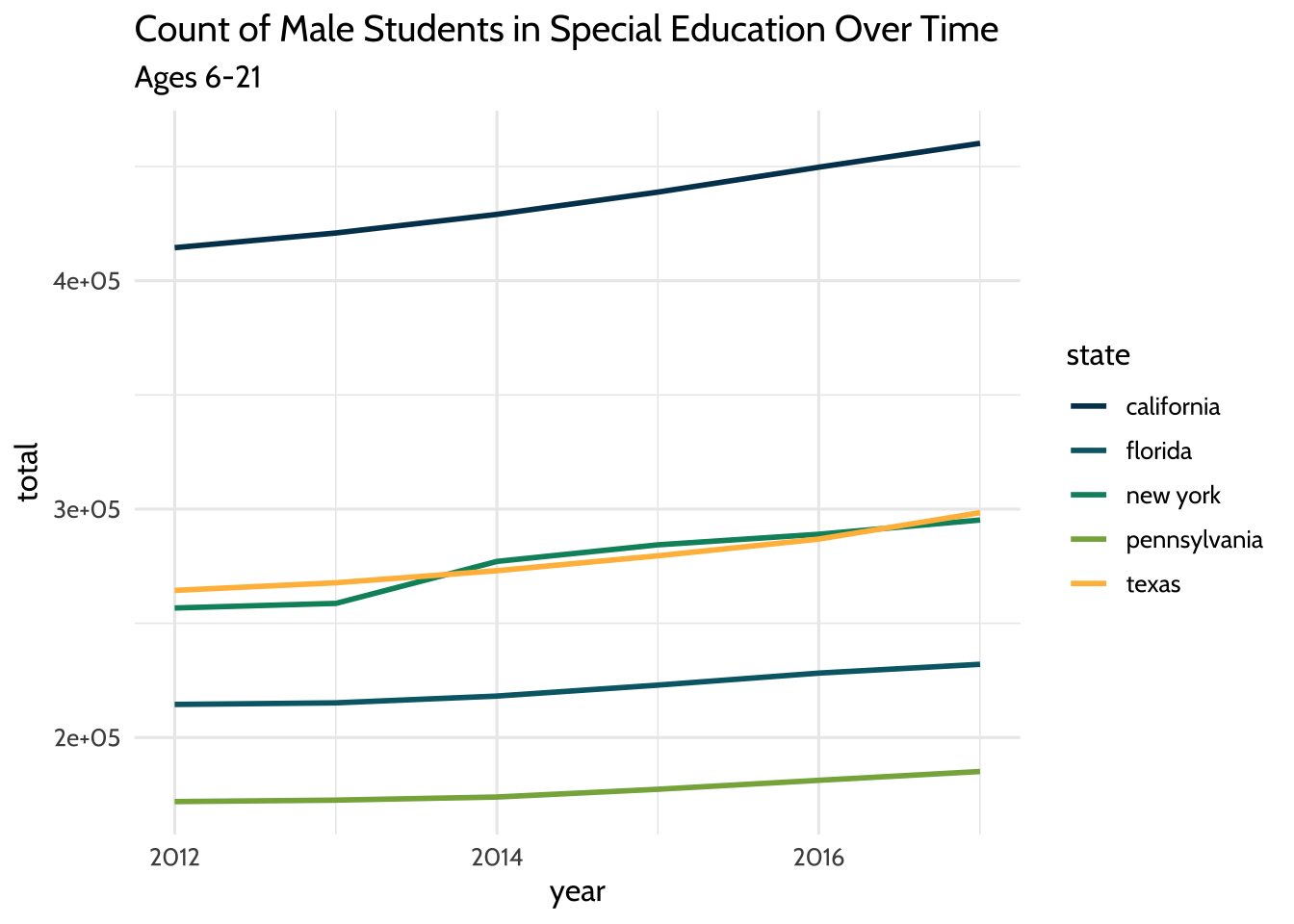
Figure 10.2: Count of Male Students in Special Education Over Time
We’ve looked at each gender separately. What do these lines look like if we
visualized the total amount of students each year per state? To do that, we’ll
need to add both gender values together and both age group values together.
We’ll do this using a very common combination of functions: group_by() and
summarize().
high_count %>%
  group_by(year, state) %>%
  summarize(n = sum(total)) %>%
  ggplot(aes(x = year, y = n, color = state)) +
  geom_freqpoly(stat = "identity", size = 1) +
  labs(title = "Total Count of Students in Special Education Over Time",
       subtitle = "Ages 3-21") +
  scale_color_dataedu() +
  theme_dataedu()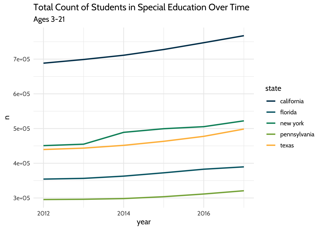
Figure 10.3: Total Count of Students in Special Education Over Time
So far we’ve looked at a few ways to count students over time. In each plot, we see that while counts have grown overall for all states, each state has different sized populations. Let’s see if we can summarize that difference by looking at the median student count for each state over the years:
high_count %>%
  group_by(year, state) %>%
  summarize(n = sum(total)) %>%
  ggplot(aes(x = state, y = n)) +
  geom_boxplot(fill = dataedu_colors("yellow")) +
  labs(title = "Median Students with Disabilities Count",
       subtitle = "All ages and genders, 2012-2017") +
theme_dataedu() 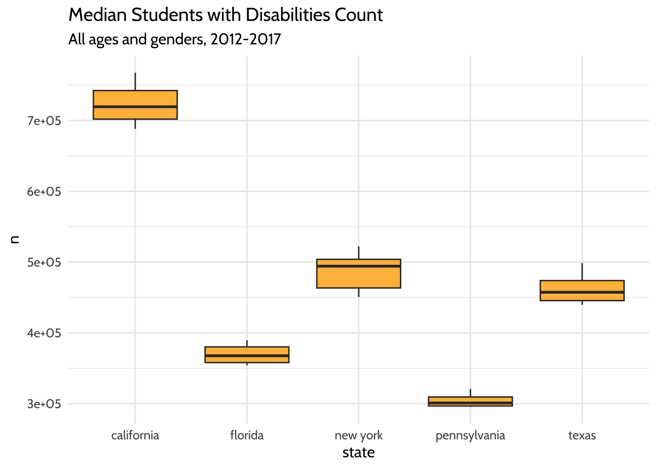
Figure 10.4: Median Students with Disabilities Count
The boxplots show us what we might have expected from our freqpoly plots
before it. The highest median student count over time is California and the
lowest is Pennsylvania.
What have we learned about our data so far? The five states in the US with the highest total student counts (not including outlying areas and freely associated states) do not have similar counts to each other. The student counts for each state also appear to have grown over time.
But how can we start comparing the male student count to the female student count? One way is to use a “ratio”, the number of times the first number contains the second. For example, if Variable A is equal to 14, and Variable B is equal to 7, the ratio between Variable A and Variable B is 2.00, indicating that the first number contains twice the number of the second.
We can use the count of male students in each state and divide it by the count of each female student. The result is the number of times male students are in special education more or less than the female students in the same state and year. Our coding strategy will be to:
- Use
pivot_wider()to create separate columns for male and female students. - Use
mutate()to create a new variable calledratio. The values in this column will be the result of dividing the count of male students by the count of female students.
Note here that we can also accomplish this comparison by dividing the number of female students by the number of male students. In this case, the result would be the number of times female students are in special education more or less than male students.
high_count %>%
  group_by(year, state, gender) %>%
  summarize(total = sum(total)) %>%
  # Create new columns for male and female student counts
  pivot_wider(names_from = gender,
              values_from = total) %>%
  # Create a new ratio column
  mutate(ratio = m / f) %>%
  ggplot(aes(x = year, y = ratio, color = state)) +
  geom_freqpoly(stat = "identity", size = 1) +
  scale_y_continuous(limits = c(1.5, 2.5)) +
  labs(title = "Male Student to Female Student Ratio Over Time",
       subtitle = "Ages 6-21") +
  scale_color_dataedu() +
  theme_dataedu()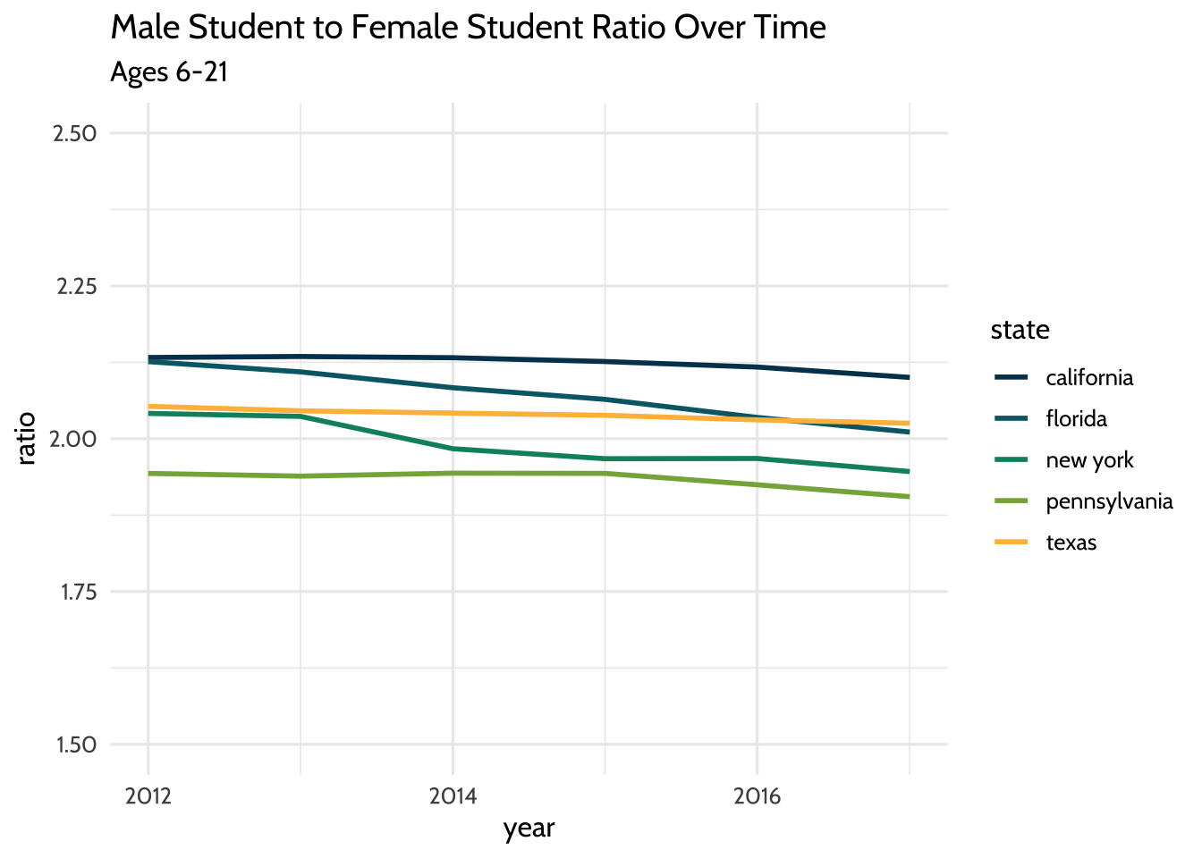
Figure 10.5: Male Student to Female Student Ratio Over Time
By visually inspecting, we can hypothesize that there was no significant change in the male to female ratio between the years 2012 and 2017. But very often we want to understand the underlying properties of our education dataset. We can do this by quantifying the relationship between two variables. In the next section, we’ll explore ways to quantify the relationship between male student counts and female student counts.
10.8.2 Model the dataset
When you visualize your datasets, you are exploring possible relationships between variables. But sometimes visualizations can be misleading because of the way we perceive graphics. In his book Data Visualization: A Practical Introduction, Healy (2019) teaches us that
Visualizations encode numbers in lines, shapes, and colors. That means that our interpretation of these encodings is partly conditional on how we perceive geometric shapes and relationships generally.
What are some ways we can combat these errors of perception and at the same time draw substantive conclusions about our education dataset? When you spot a possible relationship between variables, the relationship between female and male counts for example, you’ll want to quantify it by fitting a statistical model. Practically speaking, this means you are selecting a distribution that represents your dataset reasonably well. This distribution will help you quantify and predict relationships between variables. This is an important step in the analytic process because it acts as a check on what you saw in your exploratory visualizations.
In this example, we’ll follow our intuition about the relationship between male and female student counts in our special education dataset. In particular, we’ll test the hypothesis that this ratio has decreased over the years. Fitting a linear regression model that estimates the year as a predictor of the male to female ratio will help us do just that.
In the context of modeling the dataset, we note that there are techniques available (other than a linear regression model) for longitudinal analyses that are helpful for accounting for the way that individual data points over time can be modeled as grouped within units (such as individual students). Such approaches, like those involving structural equation models (Grimm et al., 2016) and multi-level models (West et al., 2014), are especially helpful for analyzing patterns of change over time—and what predicts those patterns. Both of the references cited above include R code for carrying out such analyses.
10.8.2.1 Do we have enough information for our model?
At the start of this section, we chose to exclude outlying areas and freely associated states. This visualization suggests that there are some states that have a child count so high it leaves a gap in the x-axis values. This can be problematic when we try to interpret our model later. Here’s a plot of female students compared to male students. Note that the relationship appears linear, but there is a large gap in the distribution of female student counts somewhere between the values of 250,000 and 1,750,000:
child_counts %>%
  filter(age == "Total, Age 6-21") %>%
  pivot_wider(names_from = gender,
              values_from = total) %>%
  ggplot(aes(x = f, y = m)) +
  geom_point(size = 3, alpha = .5, color = dataedu_colors("green")) +
  geom_smooth() +
  labs(
    title = "Comparison of Female Students to Male Students in Special Education",
    subtitle = "Counts of students in each state, ages 6-21",
    x = "Female students",
    y = "Male students",
    caption = "Data: US Dept of Education"
  ) +
  theme_dataedu()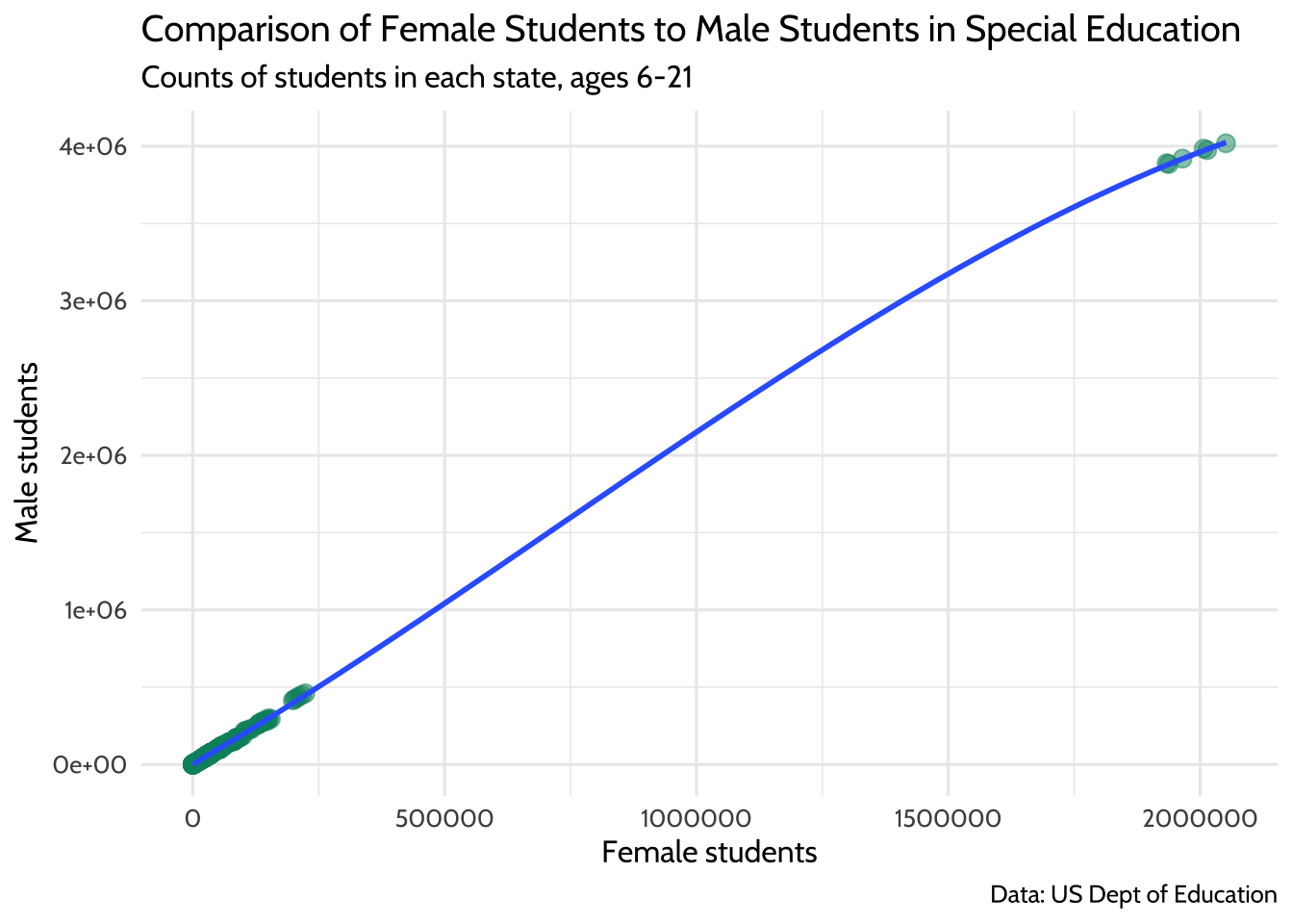
Figure 10.6: Comparison of Female Students to Male Students in Special Education
If you think of each potential point on the linear regression line as a ratio of male to female students, you’ll notice that we don’t know a whole lot about what happens in states where there are between 250,000 and 1,750,000 female students in any given year.
To learn more about what’s happening in our dataset, we can filter it for only states that have more than 500,000 female students in any year:
child_counts %>%
  filter(age == "Total, Age 6-21") %>%
  pivot_wider(names_from = gender,
              values_from = total) %>%
  filter(f > 500000) %>%
  select(year, state, age, f, m)
## # A tibble: 6 × 5
## year state age f m
## <date> <chr> <chr> <dbl> <dbl>
## 1 2012-01-01 us, outlying areas, and freely associated stat… Tota… 1.93e6 3.89e6
## 2 2013-01-01 us, outlying areas, and freely associated stat… Tota… 1.94e6 3.88e6
## 3 2014-01-01 us, outlying areas, and freely associated stat… Tota… 1.97e6 3.92e6
## 4 2015-01-01 us, outlying areas, and freely associated stat… Tota… 2.01e6 3.98e6
## 5 2016-01-01 us, outlying areas, and freely associated stat… Tota… 2.01e6 3.97e6
## 6 2017-01-01 us, outlying areas, and freely associated stat… Tota… 2.05e6 4.02e6This is where we discover that each of the data points in the upper right hand corner of the plot are from the state value “us, us, outlying areas, and freely associated states”. If we remove these outliers, we have a distribution of female students that looks more complete.
child_counts %>%
  filter(age == "Total, Age 6-21") %>%
  pivot_wider(names_from = gender,
              values_from = total) %>%
  # Filter for female student counts less than 500,000
  filter(f <= 500000) %>%
  ggplot(aes(x = f, y = m)) +
  geom_point(size = 3, alpha = .5, color = dataedu_colors("green")) +
  labs(
    title = "Comparison of Female Students to Male Students with Disabilities",
    subtitle = "Counts of students in each state, ages 6-21.\nDoes not include outlying areas and freely associated states",
    x = "Female students",
    y = "Male students",
    caption = "Data: US Dept of Education"
  ) +
  theme_dataedu()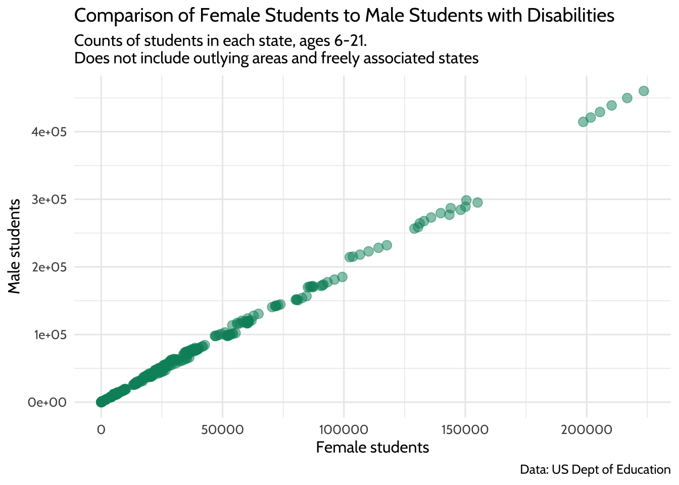
Figure 10.7: Comparison of Female Students to Male Students with Disabilities
This should allow us to fit a better model for the relationship between male and female student counts, albeit only the ones where the count of female students takes a value between 0 and 500,000.
10.8.2.2 Male to female ratio over time
Earlier, we asked the question, “Do we have enough data points for the count of female students to learn about the ratio of female to male students?” Similarly, we should ask ourselves, “Do we have enough data points across our year variable to learn about how this ratio has changed over time?”
To answer that, let’s start by making a new dataset that includes any
rows where the f variable has a value that is less than or equal to 500,000.
We’ll convert the year variable to a factor data type—we’ll see how this
helps in a bit. We’ll also add a column called ratio that contains the male to
female count ratio.
model_data <- child_counts %>%
  filter(age == "Total, Age 6-21") %>%
  mutate(year = as.factor(year(year))) %>%
  pivot_wider(names_from = gender,
              values_from = total) %>%
  # Exclude outliers
  filter(f <= 500000) %>%
  # Compute male student to female student ratio
  mutate(ratio = m / f) %>%
  select(-c(age, disability))
We can see how much data we have per year by using count():
## # A tibble: 6 × 2
##   year      n
##   <fct> <int>
## 1 2012     59
## 2 2013     56
## 3 2014     56
## 4 2015     58
## 5 2016     57
## 6 2017     55
Let’s visualize the ratio values across all years as an additional check. Note
the use of geom_jitter() to spread the points horizontally so we can estimate
the quantities better:
ggplot(data = model_data, aes(x = year, y = ratio)) +
  geom_jitter(alpha = .5, color = dataedu_colors("green")) +
  labs(title = "Male to Female Ratio Across Years (Jittered)") +
  theme_dataedu()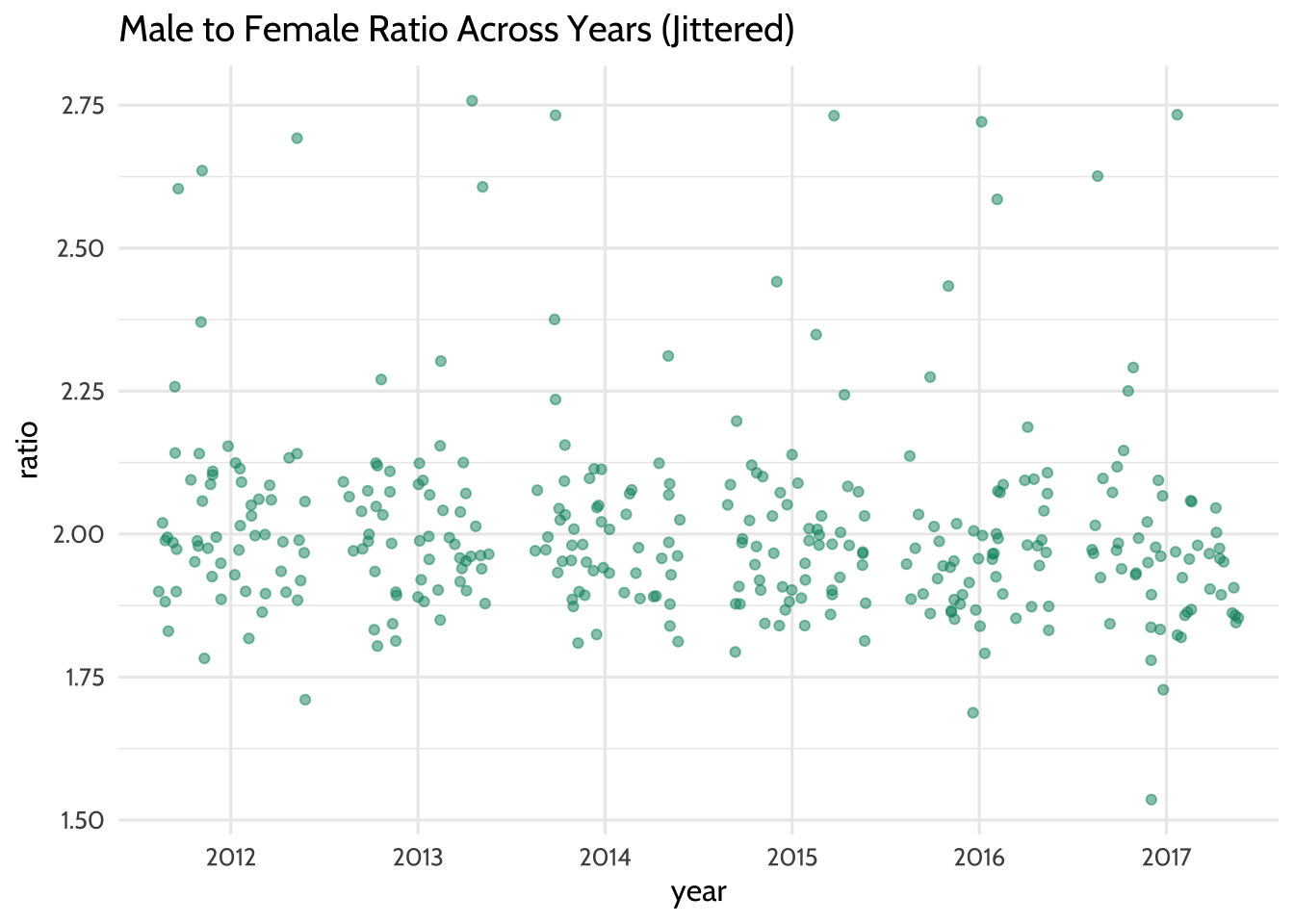
Figure 10.8: Male to Female Ratio Across Years (Jittered)
Each year seems to have data points that can be considered when we fit the model. This means that there are enough data points to help us learn how the year variable predicts the ratio variable.
We fit the linear regression model by passing the argument ratio ~ year to the
function lm(). In R, the ~ usually indicates a formula. In this case, the
formula is the variable year as a predictor of the variable ratio. The final
argument we pass to lm is data = model_data, which tells R to look for the
variables ratio and year in the dataset model_data. The results of the
model are called a “model object”. We’ll store the model object in ratio_year:
Each model object is filled with all sorts of model information. We can look at
this information using the function summary():
##
## Call:
## lm(formula = ratio ~ year, data = model_data)
##
## Residuals:
##     Min      1Q  Median      3Q     Max
## -0.4402 -0.1014 -0.0281  0.0534  0.7574
##
## Coefficients:
##             Estimate Std. Error t value Pr(>|t|)
## (Intercept)   2.0336     0.0220   92.42   <2e-16 ***
## year2013     -0.0120     0.0315   -0.38     0.70
## year2014     -0.0237     0.0315   -0.75     0.45
## year2015     -0.0310     0.0313   -0.99     0.32
## year2016     -0.0396     0.0314   -1.26     0.21
## year2017     -0.0576     0.0317   -1.82     0.07 .
## ---
## Signif. codes:  0 '***' 0.001 '**' 0.01 '*' 0.05 '.' 0.1 ' ' 1
##
## Residual standard error: 0.169 on 335 degrees of freedom
## Multiple R-squared:  0.0122, Adjusted R-squared:  -0.00259
## F-statistic: 0.824 on 5 and 335 DF,  p-value: 0.533
Here’s how we can interpret the Estimate column: The estimate of the
(Intercept) is 2.03, which is the estimated value of the ratio variable
when the year variable is “2012”. Note that the value year2012 isn’t present
in the in the list of rownames. That’s because the (Intercept) row represents
year2012. In linear regression models that use factor variables as predictors,
the first level of the factor is the intercept. Sometimes this level is called a
“dummy variable”. The remaining rows of the model output show how much each year
differs from the intercept, 2012. For example, year2013 has an estimate of
–0.012, which suggests that on average the value of ratio is 0.012 less
than 2.03. On average, the ratio of year2014 is 0.02 less than 2.03.
The t value column tells us the size of difference between the estimated value
of the ratio for each year and the estimated value of the ratio of the
intercept. Generally speaking, the larger the t value, the larger the chance
that any difference between the coefficient of a factor level and the intercept
are significant.
Though the relationship between year as a predictor of ratio is not linear
(recall our previous plot), the linear regression model still gives us useful
information. We fit a linear regression model to a factor variable, like year,
as a predictor of a continuous variable, likeratio. In doing so, we got the
average ratio at every value of year. We can verify this by taking the mean
ratio of ever year:
## # A tibble: 6 × 2
##   year  mean_ratio
##   <fct>      <dbl>
## 1 2012        2.03
## 2 2013        2.02
## 3 2014        2.01
## 4 2015        2.00
## 5 2016        1.99
## 6 2017        1.98
This verifies that our intercept, the value of ratio during the year 2012,
is 2.03 and the value of ratio for 2013 is 0.012 less than that of 2012
on average. Fitting the model gives us more details about these mean ratio
scores—namely the coefficient, t value, and p value. These values help us
apply judgement when deciding if differences in ratio values suggest an
underlying difference between years or simply differences you can expect from
randomness. In this case, the absence of “*” in all rows except the Intercept
row suggest that any differences occurring between years are within the range
you’d expect by chance.
If we use summary() on our model_data dataset, we can verify the intercept
again:
##    year       state                 f                m              ratio
##  2012:59   Length:59          Min.   :   208   Min.   :   443   Min.   :1.71
##  2013: 0   Class :character   1st Qu.:  5606   1st Qu.: 11467   1st Qu.:1.93
##  2014: 0   Mode  :character   Median : 22350   Median : 44110   Median :1.99
##  2015: 0                      Mean   : 32773   Mean   : 65934   Mean   :2.03
##  2016: 0                      3rd Qu.: 38552   3rd Qu.: 77950   3rd Qu.:2.09
##  2017: 0                      Max.   :198595   Max.   :414466   Max.   :2.69
The mean value of the ratio column when the year column is 2012 is 2.03,
just like in the model output’s intercept row.
Lastly, we may want to communicate to a larger audience that there were roughly twice the number of male students in this dataset than there were female students, and this did not change significantly between the years 2012 and 2017. When you are not communicating to an audience of other data scientists, it’s helpful to illustrate your point without the technical details of the model output. Think of yourself as an interpreter: since you can speak the language of model outputs and the language of data visualization, your challenge is to take what you learned from the model output and tell that story in a way that is meaningful to your non-data scientist audience.
There are many ways to do this, but we’ll choose boxplots to show our audience that there was roughly twice as many male students in special education than female students between 2012 and 2017. For our purposes, let’s verify this by looking at the median male to female ratio for each year:
## # A tibble: 6 × 2
##   year  median_ratio
##   <fct>        <dbl>
## 1 2012          1.99
## 2 2013          1.99
## 3 2014          1.98
## 4 2015          1.98
## 5 2016          1.97
## 6 2017          1.96
Now let’s visualize this using our boxplots:
model_data %>%
  pivot_longer(cols = c(f, m),
               names_to = "gender",
               values_to = "students") %>%
  ggplot(aes(x = year, y = students, color = gender)) +
  geom_boxplot() +
  scale_y_continuous(labels = scales::comma) +
  labs(
    title = "Median Male and Female Student Counts in Special Education",
    subtitle = "Ages 6-21. Does not include outlying areas and freely associated states",
    x = "",
    y = "",
    caption = "Data: US Dept of Education"
  ) +
  scale_color_dataedu() +
  theme_dataedu()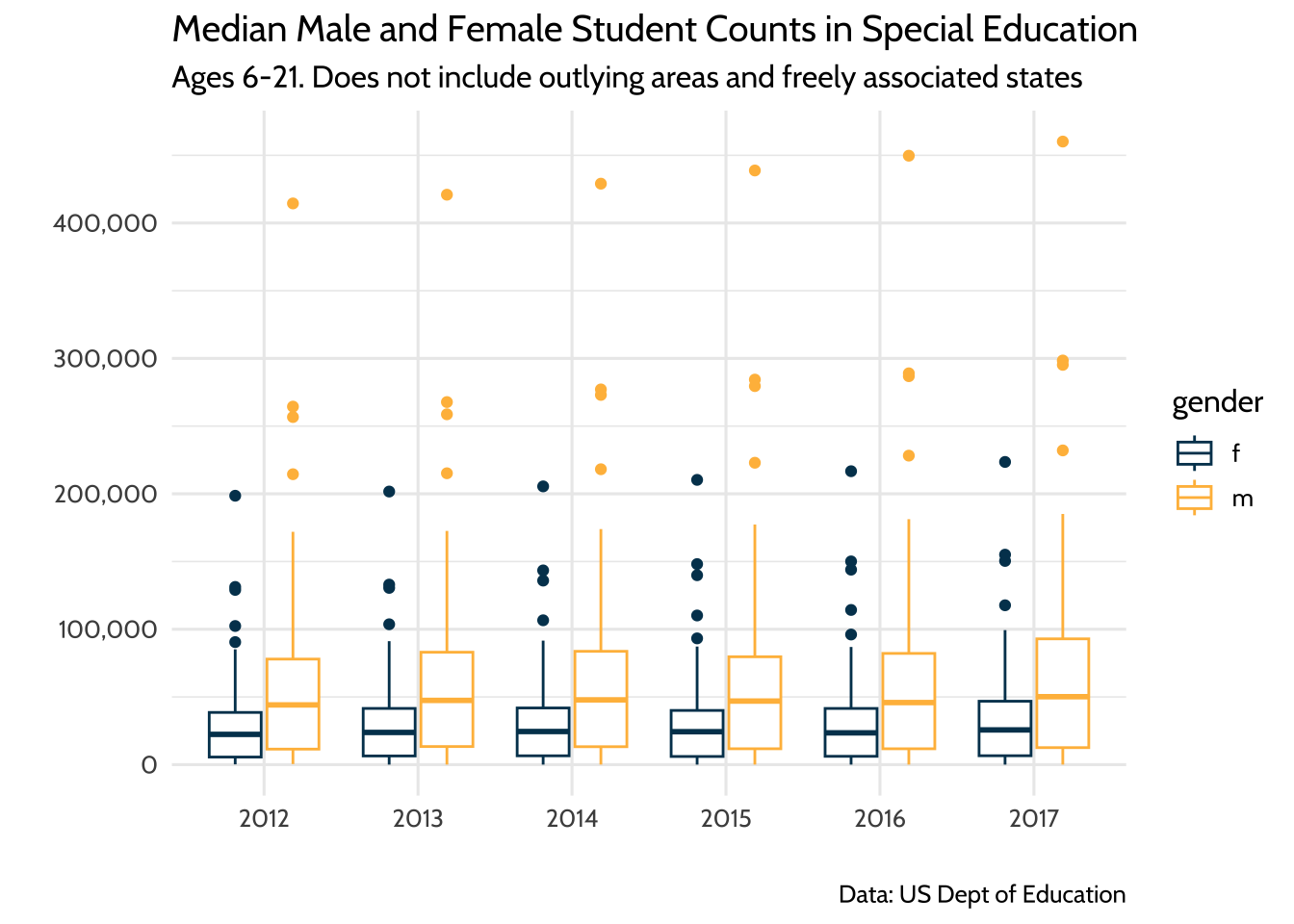
Figure 10.9: Median Male and Female Student Counts in Special Education
Once we learned from our model that male to female ratios did not change in any meaningful way from 2012 to 2017 and that the median ratio across states was about two male students to every female student, we can present these two ideas using this plot. When discussing the plot, it helps to have your model output in your notes so you can reference specific coefficient estimates when needed.
10.9 Results
We learned that each state has a different count of students with disabilities—so different that we need to use statistics like ratios or visualizations to compare across states. Even when we narrow our focus to the five states with the highest counts of students with disabilities, we see that there are differences in these counts.
When we look at these five states over time, we see that, despite the differences in total count each year, all five increased their student counts. We also learned that though the male to female ratios for students with disabilities appears to have gone down slightly over time, our model suggests that these decreases do not represent a big difference.
The comparison of student counts across each state is tricky because there is a lot of variation in total enrollment across all 50 states. While we explored student counts across each state and verified that there is variation in the counts, a good next step would be to combine these data with total enrollment data. This would allow us to compare counts of students with disabilities as a percentage of total enrollment. Comparing proportions like this is a common way to compare subgroups of a population across states when each state’s population varies in size.
10.10 Conclusion
Education data science is about using data science tools to learn about and improve the lives of our students. So why choose a publicly available aggregate dataset instead of a student-level dataset? We chose to use an aggregate dataset because it reflects an analysis that a data scientist in education would typically do.
Using student-level data requires that the data scientist be either an employee of the school agency or someone who works under a memorandum of understanding (MOU) that allows her to access this data. Without either of these conditions, the education data scientist learns about the student experience by working on publicly available datasets, almost all of which are aggregated student-level datasets.
10.10.1 Student-level data for analysis of local populations: aggregate data for base rate and context
Longitudinal analysis is typically done with student-level data because educators are interested in what happens to students over time. So if you cannot access student-level data, how do we use aggregate data to offer value to the analytic conversation?
Aggregate data is valuable because it allows us to learn from populations that are larger or different from the local student-level population. Think of it as an opportunity to learn from totaled up student data from other states or the whole country.
In the book Thinking Fast and Slow, Kahneman (2011) discusses the importance of learning from larger populations, a context he refers to as the “base rate”. The base rate fallacy is the tendency to only focus on conclusions we can draw from immediately available information. It’s the difference between computing how often a student at one school is identified for special education services (student-level data) and how often students are identified for special educations services nationally (base rate data). We can use aggregate data to combat the base rate fallacy by putting what we learn from local student data in the context of surrounding populations.
For example, consider an analysis of student-level data in a school district over time. Student-level data allows us to ask questions about our local population. One such question is, “Are the rates of special education identification for male students different from other gender identities in our district?” This style of question looks inward at your own educational system.
Taking a cue from Kahneman, we should also ask what this pattern looks like in other states or in the country. Aggregate data allows us to ask questions about a larger population. One such question is, “Are the rates of special education identification for male students different from other gender identities in the United States?” This style of question looks for answers outside your own educational system. The combination of the two lines of inquiry is a powerful way to generate new knowledge about the student experience.
So education data scientists should not despair in situations where they cannot access student-level data. Aggregate data is a powerful way to learn from state-level or national-level data when a data sharing agreement for student-level data is not possible. In situations where student-level data is available, including aggregate data is an excellent way to combat the base rate fallacy.
The documentation for the dataset is available here: https://www2.ed.gov/programs/osepidea/618-data/collection-documentation/data-documentation-files/part-b/child-count-and-educational-environment/idea-partb-childcountandedenvironment-2017-18.pdf↩︎